Plots with ROOTs
Data visualization with gnuplot | Student code reference
01 — Read a plot command
01 — FIRST STEPS Read and modify the class-count plots
The Titanic table
The live notebook names this table titanic_by_class. Rows represent three passenger
classes and Crew, a separate group, not a fourth class. Counts include everyone
in titanic_by_class.csv from Zenodo (v1.0.1).
| Class | Aboard | Survived | Died |
|---|---|---|---|
| 1st | 324 | 201 | 123 |
| 2nd | 284 | 118 | 166 |
| 3rd | 709 | 181 | 528 |
| Crew | 890 | 211 | 679 |
Read the first grouped plot
The live notebook's first useful comparison plots survivors and deaths side-by-side (listing 1). Start with the source, then read the column mapping and appearance options from left to right.
plot data using 3:xtic(1) title "Survived", \
     ''   using 4         title "Died"
| Code / option | Meaning |
|---|---|
plot |
Draw a 2D graph. A comma adds another series to the same axes. |
data |
Source table supplied to the Org block as a temporary data file. |
using 3 |
Use column 3, Survived, as the bar height. |
xtic(1) |
Use column 1, Class, as the category labels. |
title "Survived" |
Name this series in the legend; it is not the chart title. |
'' |
Reuse the preceding data source. |
using 4 |
Use column 4, Died, for the second series. |
\ |
Continue one gnuplot command on the next line. |
Colours describe a plot's question
Compare the stacked counts in listing 4 with the sex comparison in listing 9. Both plots are printed beside their code. Blue represents survivors in the first, women in the second. Linetype numbers select styles, not meanings; the series and legend define what each colour represents.
| Example in this handout | Linetype 1 | Linetype 2 |
|---|---|---|
| Stacked counts, listing 4 | Survived, blue | Died, grey |
| Sex comparison, listing 9 | Women, blue | Men, orange |
What the options draw
| Code / option | Meaning |
|---|---|
set style data histograms |
Treat rows as categories and draw bars. |
set style histogram clustered |
Put each series beside the others in its category. |
set style fill solid 0.9 |
Fill bars at 90% opacity. |
set yrange [0:*] |
Start the count axis at zero; choose the upper limit automatically. |
set ylabel "People aboard" |
Label the vertical axis with its quantity. |
set key top left |
Place the legend at the upper left. |
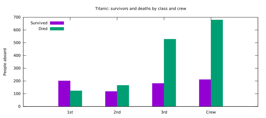
Listing 1 draws both count columns;
using 3alone draws only survivors. Listing 6 adds deliberate colours, guides and axis styling.
A few pieces of punctuation
| Code / option | Meaning |
|---|---|
# comment |
Ignore text through the end of a line. |
, |
Separate series in plot; separate function arguments. |
: |
Separate fields in using and range limits. |
(...) |
Group a calculation or function arguments. |
set / unset |
Turn a setting on or off. |
reset |
Restore gnuplot's defaults and clear prior plot settings. |
Check a row before plotting
The table itself gives useful checks: 201 + 123 = 324 in first class and
211 + 679 = 890 for Crew. Across all four groups there are 2,207
people, 711 of whom survived. If a later edit breaks these sums, check
the table before debugging the plot.
| Check | Titanic result |
|---|---|
| Survivors + died | Equals aboard in every row. |
| First-class row | 201 + 123 = 324. |
| All rows together | 2,207 aboard; 711 survived. |
02 — Columns and calculations
02 — USING Select columns, calculate rates, label the result
Column numbers in titanic_by_class
| Code / option | Meaning |
|---|---|
using 3 |
Column 3 supplies y, the value to plot. |
using 0:3 |
Explicit x:y; column 0 is row number 0, 1, 2, … |
using 3:xtic(1) |
Plot column 3 and label categories from column 1. |
$3 |
Column 3 of the current row, inside an expression. |
strcol(1) |
Read column 1 as text. |
column(0) |
Row number; handy when labels are text categories. |
Gnuplot reads the first numeric field as y if only one is given. For numeric
x and y, write both fields: using 1:2. Parentheses distinguish a calculation
from a column number: using ($3/$2*100) means a percentage, while using 3
means column 3.
Labels versus coordinates: xtic(1) labels equally spaced categories;
it does not set x positions. For ages 1, 4 and 10, use the age column as x
to preserve gaps of 3 and 6 years. Row numbers would make the gaps equal.
Survival rates from the counts
For each class, survival rate is survived / aboard. In first class that is
201 / 324 = 62.0%. The live notebook computes this from columns 3 and 2,
then plots bars and percentage labels (listing 2).
set yrange [0:100]
set format y "%.0f%%"
plot data using 0:($3/$2*100):xtic(1) \
       with boxes notitle, \
     '' using 0:($3/$2*100): \
       (sprintf("%.1f%%", $3/$2*100)) \
       with labels notitle
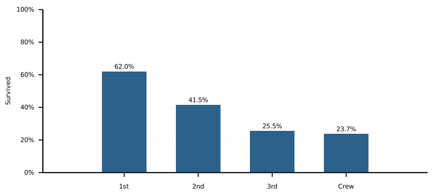
Read the four rate bars
| Class | Survived / aboard | Rate |
|---|---|---|
| 1st | 201 / 324 | 62.0% |
| 2nd | 118 / 284 | 41.5% |
| 3rd | 181 / 709 | 25.5% |
| Crew | 211 / 890 | 23.7% |
The bar height is the rate, not the survivor count. Third class has 181 survivors but 709 passengers aboard; the denominator is what makes the bar comparable with the smaller classes.
Expressions and formatted labels
| Code / option | Meaning |
|---|---|
$3/$2 |
Divide survivors by people aboard in the group. |
$3/$2*100 |
Convert the fraction to a percentage. |
($3/$2*100) |
Parentheses say “calculate this value” in using. |
sprintf("%.1f%%", value) |
Format text with one decimal and a literal percent sign. |
with boxes |
Draw bars at the supplied x and y positions. |
with labels |
Draw text at x:y; the third field supplies the text. |
notitle |
Do not add this plot element to the legend. |
The plot command above draws the same values twice: bars first, labels
second. offset 0,1 moves labels above the bars; it is measured in character
heights. set offsets 0.5,0.5,0,0 leaves horizontal room at both ends.
Other useful arithmetic
| Code / option | Meaning |
|---|---|
+ - * / |
Add, subtract, multiply, divide. |
** |
Power, as in x**2. |
== != < <= > >= |
Compare values; useful in conditional expressions. |
condition ? a : b |
Choose a if true, otherwise b. |
sprintf(...) |
Turn a calculated number into display text. |
stats data using 2 nooutput |
Summarise a column without drawing it; the pie uses STATS_sum. |
Use 711.0 / total when the result must be fractional: integer-only division
can discard the fractional part. Variables are case-sensitive; ordinary
variables are named total, while $3 refers to a data column.
Women and men use separate denominators
The comparison in listing 9 uses each group's own aboard count.
| Group | Rate expression |
|---|---|
| Women | $3/$2*100 |
| Men | $6/$5*100 |
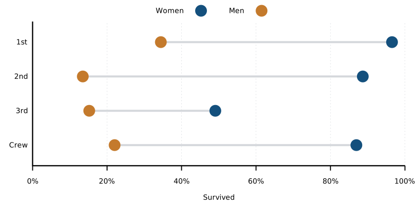
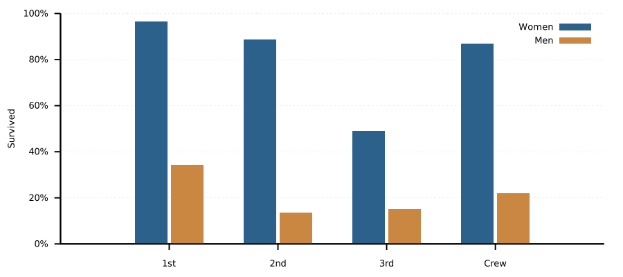
First-class women: 139/144 = 96.5%. First-class men: 62/180 = 34.4%.
03 — Counts, shares and rates
03 — BAR CHOICES Same people, three different questions
Grouped bars: compare counts
Use grouped bars when the values should be compared side by side. In the Titanic figure, each class has one bar for survivors and one for deaths.
set style data histograms
set style histogram clustered gap 1
set yrange [0:*]
plot data using 3:xtic(1) title "Survived", \
     ''   using 4         title "Died"
| Code / option | Meaning |
|---|---|
histograms |
Category bars; this does not bin raw measurements. |
clustered |
Place series side by side. |
gap 1 |
Leave roughly one bar width between category groups. |
yrange [0:*] |
Keep count bars honest by starting at zero. |
Stacked bars: compare group size
set style histogram rowstacked
plot data using 3:xtic(1) title "Survived", \
     ''   using 4         title "Died"
rowstacked puts each class's series in one bar. Its total height is everyone
aboard: 324 in first class, 284 in second, 709 in third, 890 crew. This answers a
different question from the grouped chart.
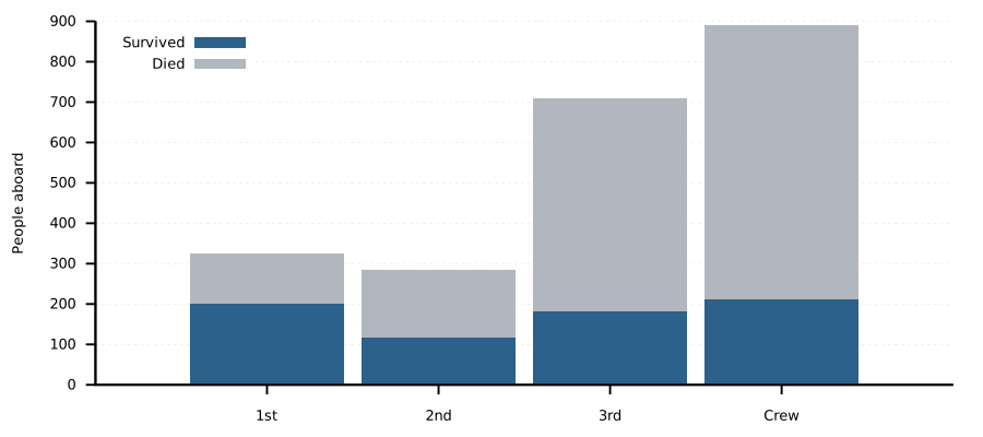
handout-stacked.svg).100% stacked bars: compare shares
Divide each outcome by the class total before stacking. The surviving and dead portions now add to 100% in each class (listing 5).
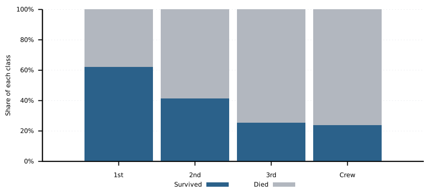
Every bar reaches 100%. Compare the blue portions: 62.0%, 41.5%, 25.5% and 23.7% survived. The grey portions are the complementary death shares.
Keep the questions distinct
| Plot | What it compares |
|---|---|
| Grouped counts | Number who survived and died in each class. |
| Stacked counts | Total people per group and each outcome's part of the total. |
| 100% stacked | Outcome shares within each class, regardless of class size. |
| Rate bars | Survival chance within each class: survivors / aboard. |
Crew has the most deaths and is also the largest group. Rates compare chances within groups. A pie is also a share plot, but is harder to compare precisely; use it for one composition only.
Ask the question, then choose the calculation
| Ask | Titanic answer |
|---|---|
| How many died in third class? | 528 passengers. |
| What share of third class died? | 528/709 = 74.5%. |
| What fraction of third class survived? | 181/709 = 25.5%. |
Counts and rates describe different things. Third class had more deaths (528) than first and second combined (289), while the survival rate compares each class using its own total.
04 — Styling and axes
04 — APPEARANCE Make the same Titanic plot readable and repeatable
Shared style from the live notebook
<<plot-style>> inserts the notebook's shared settings (Noweb).
Edit plot-style once to change the defaults for every plot.
set border 3 lw 1.9
set tics out nomirror scale 0.9
set grid ytics lc rgb "#d5d8dc" lw 0.5
set key top left
set linetype 1 lc rgb "#14507d"
set linetype 2 lc rgb "#aab0b8"
set style fill solid 0.9 border -2
| Code / option | Meaning |
|---|---|
border 3 |
Draw bottom and left borders: 1 + 2 = 3. |
lw 1.9 |
Set line width to 1.9 times the nominal width. |
tics out nomirror |
Point ticks outward; skip duplicate ticks on the far edges. |
grid ytics |
Draw horizontal guides at y tick marks. |
lc rgb "#14507d" |
Set line or fill colour with a hex RGB value. |
linetype 1 / 2 |
Reuse chosen colours for successive plot series. |
fill solid 0.9 |
Fill bars almost opaquely. |
border -2 |
Match the bar outline to its fill. |
Dumbbell: show the gap
Each line connects men's and women's rates within a group (listing 7). Its length is the gap in percentage points.
plot sex using ($6/$5*100):0: \
  (($3/$2-$6/$5)*100):(0):ytic(1) \
  with vectors nohead notitle, \
  '' using ($3/$2*100):0 with points title "Women", \
  '' using ($6/$5*100):0 with points title "Men"
| Code / option | Meaning |
|---|---|
x:y:dx:dy |
Starting point and horizontal / vertical displacement. |
with vectors nohead |
Draw a segment without an arrowhead. |
with points |
Draw symbols at the two rates. |
ytic(1) |
Put class names on the vertical axis. |
For 2D borders, add flags: bottom 1, left 2, top 4, right 8.
set border 3 selects bottom + left (1 + 2).
Other examples: set border 1 (bottom), set border 12 (top + right),
set border 15 (all four); unset border removes all borders.
Labels, ranges and legends
| Code / option | Meaning |
|---|---|
set xlabel / set ylabel |
Name the horizontal and vertical quantities. |
set yrange [0:*] |
Fix the lower end at zero; choose the upper end automatically. |
set yrange [0:100] |
Fix both ends for percentages. |
set format y "%.0f%%" |
Display integer tick labels with a percent sign. |
set key top left |
Place the legend. Other positions include below and outside. |
unset key |
Remove the legend when labels or context make it unnecessary. |
set offsets |
Add a margin around plotted values. |
set title |
Add a title inside the figure. |
The values must already be percentages for %.0f%% to be truthful. Axis
labels should say what a number measures, such as People aboard or Survived.
The live notebook keeps plot titles in captions, so the graph stays uncluttered.
Reuse the style outside Org
C-c C-v t tangles the named block to orgmode/plots/plot-style.gp. A plain gnuplot
script can then use load "orgmode/plots/plot-style.gp". A personal ~/.gnuplot also
sets defaults, but those settings are hidden from someone opening the script.
<<plot-style>>
set ylabel "People aboard"
plot data using 3:xtic(1) title "Survived", \
     ''   using 4         title "Died"
Recolour the sex comparison
set linetype 1 lc rgb "#14507d"  # women
set linetype 2 lc rgb "#c47a2c"  # men
plot sex using ($3/$2*100):xtic(1) title "Women", \
     ''  using ($6/$5*100)         title "Men"
handout-sex.svg).
The colour belongs to the series; title gives the series its meaning in
the legend. Readers should not have to guess what blue represents.
05 — Beyond bars
05 — OTHER PLOTS Pie and heatmap recipes from the Titanic lessons
Pie: one whole divided into classes
The live pie uses the counts in column 2. Each group becomes a
wedge proportional to its share of 2,207 people. This is a constructed pie
from circle wedges, a compact recipe that remains valid in gnuplot 6.
The running angle angle_end carries each slice's end into the next row.
unset polar
set autoscale
stats data using 2 nooutput
total = STATS_sum
angle_for_count(n) = n * 360.0 / total
set angles degrees
set size ratio -1
set xrange [-1.05:1.05]
set yrange [-1.05:1.05]
set style fill solid 1 border linecolor rgb "white"
angle_end = 0
plot data using (0):(0):(1):(angle_end): \
  (angle_end = angle_end + angle_for_count($2)):($0+1) \
  with circles linecolor variable notitle
| Code / option | Meaning |
|---|---|
stats ... nooutput |
Compute summary values without drawing a graph. |
STATS_sum |
Sum of the selected column. |
angle_for_count(n) |
Convert a count into its share of 360 degrees. |
with circles |
With x, y, radius, start and end angles, draw a wedge. |
linecolor variable |
Choose colour from a value in the row. |
angle_end = ... |
Carry each wedge's ending angle to the next row. |
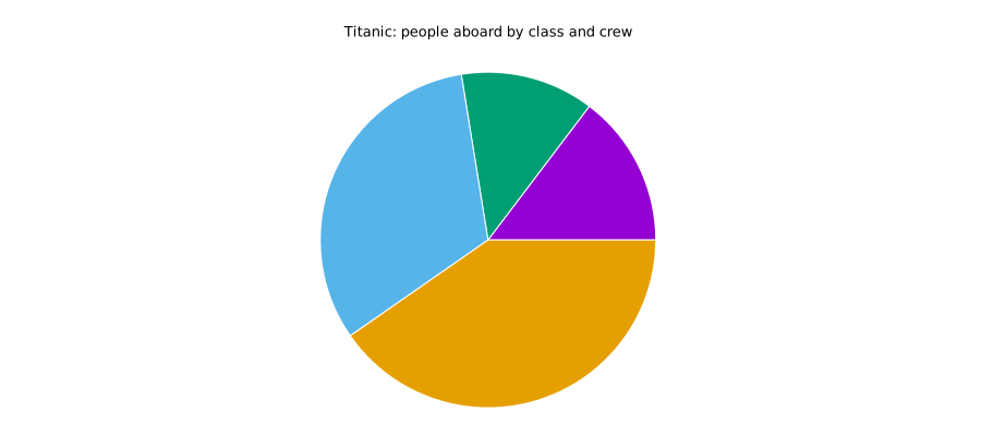
The Crew wedge is largest: 890/2207 = 40.3% of everyone aboard.
This is a share of the dataset, not a survival rate. Starting at the right
and moving anticlockwise, the unlabelled slices follow the table order:
1st, 2nd, 3rd, Crew. This keeps the first plotting step short.
Run stats with polar mode off and before setting the fixed ranges.
Challenge 12 adds names and percentages as a separate label pass, using the middle angle of each slice. The geometry remains unchanged.
Heatmap: class by sex
The notebook's heatmap places women at x=0, men at x=1, and one class per row. Cell colour encodes survival rate; the reversed y range puts first class at the top (listing 11).
The titanic_by_sex table stores women's aboard and survived counts in columns
2 and 3, men's in columns 5 and 6. Each rate uses the matching aboard count.
set palette defined (0 "#ffffff", 100 "#4f86b5")
set cbrange [0:100]
set xrange [-0.5:1.5]
set yrange [3.5:-0.5]
set xtics ("Women" 0, "Men" 1)
plot sex using (0):0:(0.5):(0.5):($3/$2*100) \
  with boxxyerror lc palette, \
     '' using (1):0:(0.5):(0.5):($6/$5*100) \
  with boxxyerror lc palette
| Code / option | Meaning |
|---|---|
palette |
Map numbers to a sequence of colours. |
cbrange [0:100] |
Fix the colour scale to a percentage range. |
set xtics (...) |
Place Women and Men at x positions 0 and 1. |
boxxyerror |
Draw a rectangle from centre x:y and half-width:half-height. |
lc palette |
Pick each rectangle's colour from the extra value. |
set yrange [3.5:-0.5] |
Reverse vertical order so the first class is at the top. |
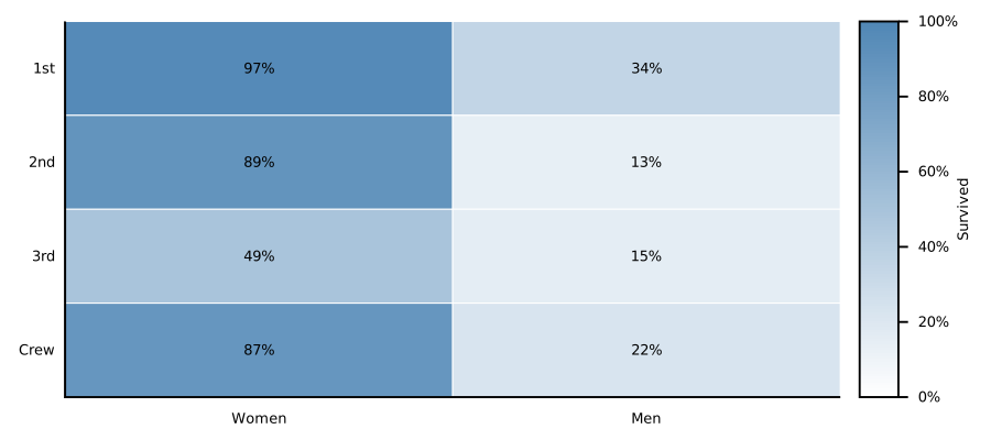
Read colour and number together
Women in first class have the darkest cell: 139/144 = 96.5% survived.
Men in second class have the lightest: 24/178 = 13.5%. The labels show
exact values; the colour scale helps locate high and low values quickly.
The eight rates also appear in the grouped bars (listing 9) and
dumbbell chart (listing 7). Bars encode rate by height, the dumbbell by position, and this
heatmap by colour. Fixing cbrange [0:100] keeps colours comparable when
another dataset is plotted.
06 — More Titanic plot patterns
06 — PROFILES AND DETAILS Spider plots, donuts and sparklines
Spider plot: several measures per class
The live spider plot uses five percentages for each class: overall survival,
women's survival, men's survival, and the shares of women and men aboard
(listing 12). Each row of titanic_by_sex makes a polygon; every plot component
adds an axis.
set spiderplot
set for [p=1:5] paxis p range [0:100]
set grid spiderplot
plot sex using (($3+$6)/($2+$5)*100):key(1) \
       with spiderplot notitle, \
     sex using ($3/$2*100) with spiderplot notitle, \
     sex using ($6/$5*100) with spiderplot notitle, \
     sex using ($2/($2+$5)*100) with spiderplot notitle, \
     sex using ($5/($2+$5)*100) with spiderplot notitle
| Code / option | Meaning |
|---|---|
set spiderplot |
Use radial axes rather than x and y axes. |
paxis p range [0:100] |
Give each measure the same percentage scale. |
for [p=1:5] |
Apply the range setting to each of the five axes. |
set grid spiderplot |
Draw the radial guide lines. |
with spiderplot |
Add one axis value per plot component. |
key(1) |
Name each polygon from column 1, the class. |
The course uses gnuplot 6.0 or newer. The shape depends on axis order; use bars when exact comparisons are more important than seeing a profile.
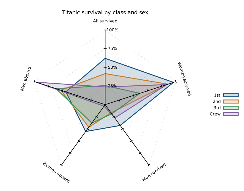
The two aboard shares sum to 100% in each class. First class reaches 96.5% on the women's survival axis but only 34.4% on the men's.
Donut: class size and fate together
The fig-7e block in gnuplot_guide_orgmode.org draws annular sectors:
survivors and deaths outside, class sizes inside. The positive inner radius
leaves a real hole; no white covering circle is needed. Reset pos before
each pass so the group boundaries align across both rings.
| Code / option | Meaning |
|---|---|
with sectors |
Draw a ring segment from its start angle, inner radius and two widths. |
pos = 0 |
Restart accumulated angles for another layer. |
($0 + 3) |
Use row number plus 3 to select a class colour. |
hole_radius |
Inner boundary; split_radius - hole_radius is the class ring's width. |
with labels |
Place class names and rate labels around the rings. |
set size ratio -1 |
Keep circles circular by using a square scale. |
The two rings occupy separate radial intervals: 0.40-0.72 for class and 0.72-1.00 for outcomes. Class names sit halfway across the inner ring; rate labels sit outside radius 1. Labels use polar angle:radius positions.
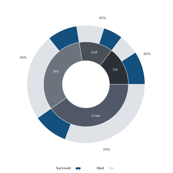
Inner ring: class size. Outer ring: outcome within each class. The outside labels give each class's survival rate.
Sparklines: a plot inside a sentence
titanic_by_age supplies counts and survival rates for the 120-by-24-pixel
sparklines. Both include crew and omit unknown ages.
unset border; unset tics; unset key; unset grid
set margins 0,0,0,0
set yrange [0:100]
plot data using 0:3 with lines
Age-group counts  and survival rates
 , across 25 three-year groups, from ages 0–2 to 72–74.
Listing 15 shows how to select an SVG output file.
, across 25 three-year groups, from ages 0–2 to 72–74.
Listing 15 shows how to select an SVG output file.
07 — Org Babel and output
07 — RUN AND EXPORT Connect Org tables, gnuplot and the figure files
A plot block linked to the Titanic table
The table name is from Org. The name data on the left of the equals sign is
chosen by the author; it is not a gnuplot keyword.
#+begin_src gnuplot :var data=titanic_by_class \
    :file orgmode/figures/by_class_outcomes_stacked.svg
<<plot-style>>
set style histogram rowstacked
plot data using 3:xtic(1) title "Survived", \
     ''   using 4         title "Died"
#+end_src
| Org option | Meaning |
|---|---|
:var data=titanic_by_class |
Pass the named Org table to the block as data. |
:file name.svg |
Save the plot to an SVG file. |
:term "svg size ..." |
Choose image format and dimensions. |
:session none |
Run in a fresh gnuplot process each time. |
:colnames yes |
Use Org's header information; gnuplot gets only data rows. |
:results file graphics replace |
Insert or replace the result image link. |
:noweb no-export |
Expand <<plot-style>> when running; show the reference when exporting. |
Running blocks in Doom Emacs
| Key | Does |
|---|---|
C-c C-c |
Run the block under the cursor. |
C-c C-v b |
Run every block before export. |
C-c C-x C-v |
Show or hide inline plots. |
C-c C-e l o |
Export PDF and open it. |
C-c C-e h o |
Export HTML and open it. |
Export uses stored results: rerun changed plots first. A fresh gnuplot session avoids inheriting settings from an earlier plot.
Small output: the sparkline settings
These options complement the sparkline in listing 13. The terminal defines the SVG canvas; the document controls its printed size.
| Code / option | Meaning |
|---|---|
:term "svg size 120,24" |
Make a wide, shallow image. |
set margins 0,0,0,0 |
Remove space reserved for axes and labels. |
unset <option> |
Disable a setting, e.g. unset tics. |
using 0:3 |
Put rows on x and age-group rate on y. |
set yrange [0:100] |
Keep rates on a comparable scale. |
Counts peak at ages 21–23.
Rates peak at 67.9% for ages 3–5; the
three oldest groups have no recorded survivors and very small counts.
Crew is included; only the two missing ages are excluded.
Standalone gnuplot script
Run terminal/all.gp from terminal/ for the complete CSV examples.
Listing 15 illustrates output setup using a $T data block.
set terminal svg size 900,400 font "sans,13"
set output "chart.svg"
set style data histograms
set yrange [0:*]
plot $T using 3:xtic(1) title "Survived", \
     '' using 4 title "Died"
unset output
| Code / option | Meaning |
|---|---|
$T << EOD |
Begin a named data block; close it with EOD. |
set terminal |
Select SVG, PDF, PNG or another output driver. |
set output |
Name the output file. |
unset output |
Close and flush the output file. |
load "orgmode/plots/plot-style.gp" |
Read shared commands from another script. |
The same plot in Org and in a script
| Org Babel | Standalone gnuplot |
|---|---|
:var data=titanic_by_class |
$T << EOD data block |
:file chart.svg |
set output "chart.svg" |
:term "svg size ..." |
set terminal svg size ... |
<<plot-style>> |
load "orgmode/plots/plot-style.gp" |
| Org inserts a result link. | Gnuplot writes the named file. |
In both cases the plot command reads the same columns. Only the way data
and output reach gnuplot changes.
Troubleshooting from the Titanic plots
| Symptom | Check |
|---|---|
| Only one outcome appears | Put both series in the same comma-separated plot. |
| Wrong class names | Check xtic(1) and the first table column. |
| Wrong rate | Confirm numerator and denominator; women and men have different totals. |
| The first bar disappears | Org removes table headers; do not skip a row with every ::1. |
| An old colour appears | Start with reset or explicitly set the linetypes. |
| Labels collide with the edge | Add set offsets or adjust the axis range. |
Try a controlled change
In the standalone script, change set yrange [0:*] to [0:250] and
regenerate the class-count plot. Then change the file name in set output.
The counts stay the same; the visible scale and saved filename change.
Further reading: Org Babel gnuplot tutorial (historical advice);
Plotting tables with org-plot (#+PLOT: options).
08 — Working in Bash or a terminal
08 — TERMINAL WORKFLOW Prepare data, write a file, save, run, inspect
Check the tools first
Use Bash or Git Bash, gnuplot 6.0+, curl, a text editor and a browser. Install gnuplot separately when using Git Bash.
for p in bash gnuplot curl head cat mkdir; do
  command -v "$p" || printf 'MISSING: %s\n' "$p"
done
gnuplot --version
Fix missing programs first; gnuplot_guide_terminal.org has the full SVG check.
Stay in one working directory
Run listing 17 from the course folder; then stay in terminal/.
mkdir -p terminal
cd terminal
mkdir -p data figures plots
export LC_NUMERIC=C
| Code / option | Meaning |
|---|---|
pwd |
Show the current working directory. |
cd "course folder" |
Quote paths containing spaces; use forward slashes in Git Bash. |
LC_NUMERIC=C |
Keep decimal-point numeric formatting, consistent with the CSVs. |
export |
Pass the setting to programs started from this shell. |
If LC_ALL is set, use unset LC_ALL first. Script paths are relative
to the working directory: stay in terminal/, not plots/.
Download and inspect the data
From terminal/, use the download loop in chapter 1 of
gnuplot_guide_terminal.org to retrieve all five CSVs from
Zenodo version 1.0.1 into data/.
Both lessons use the published summaries directly; no AWK preparation
is needed.
Downloaded CSV (in data/) |
Use |
|---|---|
titanic.csv |
Inspect person-level records. |
titanic_by_class.csv |
Class/crew counts and outcomes. |
titanic_by_sex.csv |
Class-and-sex comparisons. |
titanic_by_age.csv |
Three-year age sparklines. |
titanic_by_age_and_class.csv |
Large age/class heatmap. |
Counts cover 2,207 people and 711 survivors; age summaries exclude two
unknown ages. Use set datafile separator "," and
set datafile columnheaders so gnuplot reads CSV and treats the header
as metadata. Do not also skip the first data record.
Write and save before running
Save listing 18 as plots/by_class_aboard.gp inside terminal/.
Use the .gp extension, not .gp.txt.
reset
set encoding utf8
set datafile separator ","
set datafile columnheaders
data = 'data/titanic_by_class.csv'
set terminal svg size 900,300 font 'sans,13'
set output 'figures/by_class_aboard.svg'
set style data histograms
set yrange [0:*]
plot data using 2:xtic(1) title "Aboard"
unset output
In Bash, run the saved file with listing 19:
gnuplot -d plots/by_class_aboard.gp
Open figures/by_class_aboard.svg in a browser. After editing: save the file,
rerun the command, then reload the browser. SVG output does not open a plot
window automatically.
Commands for terminal plotting
| Command / option | Where and what it does |
|---|---|
set terminal svg |
In the script: choose SVG output. |
set output 'figures/chart.svg' |
In the script: choose the output filename. |
load 'style.gp' |
In the script: read saved shared settings. |
unset output |
In the script: finish writing the output file. |
Keep Bash and gnuplot separate
Run listing 19 in Bash. Put plot, set and load in the
script or at the gnuplot> prompt; do not copy the prompt itself.
Bash expands $3 as a shell parameter; gnuplot reads it as column 3.
Shared style and the complete set
Save style.gp in terminal/ before using the styled plots in chapter 6.
It changes appearance; it does not create the data or draw a figure.
all.gp is created in the rerun topic of the terminal lesson.
Lines such as load 'plots/by_class_aboard.gp' run the saved plots. Prepare all
sixteen scripts, style.gp and the three tables before gnuplot -d all.gp.
Cannot open a file? Check pwd, spelling and prerequisites.
Tangling recreates solution files and overwrites local edits; students
can write every file manually.
Companion: gnuplot_guide_terminal.org. Keep downloaded CSVs and saved scripts together
to rebuild the figures offline.
Optional book: Philipp K. Janert, Gnuplot in Action, Second Edition
(Manning, 2016).