Plots with ROOTs
Data visualization with gnuplot | Titanic plotting challenges
Use this sheet alongside either live-coding guide. Chapter numbers match both lessons; the links name the exact starting listing. Choose tasks as you reach each topic: the times are per challenge, not a requirement to complete the whole sheet in one sitting. No new data or preprocessing is needed.
Work on a copy. In Org, give copied blocks unique names and new :file
paths. In the terminal, save a new .gp file, change its set output path
and run it with gnuplot -d plots/your-file.gp from the lesson's working
directory. Keep a before/after figure and a short explanation. Restore
shared-style experiments before moving on. Do not run author extraction
over unsaved exercise work.
Predict, change, explain
Before editing, predict one thing that should change and one thing that should stay the same. Make the smallest useful edit, rerun and compare. The check at the end of each task tells you what to keep: usually a figure and one or two sentences. The discussion question is an invitation to explain a choice, not a request for more code. Working in pairs, let one person edit and the other check the figure against the data; then swap.
Start with chapters 0-4 for a first success, use chapters 5-10 to improve comparisons, and choose from chapters 11-17 to explore other chart forms. Chapters 18-20 turn those plotting skills into a repeatable, checked workflow. The suggested times cover the core task; allow more time for discussion. No answer depends on choosing exactly the instructor's colours.
This edition repeats each challenge and follows it with a worked solution. The website keeps those solutions closed until you choose to reveal them. The code listings below are edits to the linked lesson examples, not standalone scripts unless explicitly stated. Retain each example's input/output setup and use new output names in your own working copy.
0 — Start here
Challenge 1 — A working plotting environment (3 min)
Before changing a plot, make sure you can explain how it is produced. A terminal window, an Org buffer and gnuplot play different roles: one starts the work, another may supply the data, and gnuplot draws the figure. Knowing those boundaries makes later error messages much less mysterious.
Start: Org chapter · Terminal chapter.
- Check that your environment can run gnuplot and curl. Record the gnuplot version.
- Locate where this lesson will read its input and write its figures. Explain which tool runs the plotting code.
Hint: The terminal guide separates Bash commands from gnuplot statements; the notebook supplies data through Babel headers.
Check: A version number and the input/output locations for your chosen environment.
Discuss: If the output does not appear, which part of your workflow would you check first?
Show solution and discussion
Worked solution 1 — A working plotting environment
Run listing 1 in a shell (or a Bash block in Org). The
version must satisfy the lesson's gnuplot 6.0 minimum; its exact patch number
depends on your installation. pwd reports where relative paths begin.
gnuplot --version
curl --version
pwd
In the terminal lesson, run from terminal/: scripts read data/*.csv and
write figures/*.svg or figures/*.png. In Org, the named download results
supply tables through :var; :file gives the result path, relative to the
block's working directory (the notebook directory unless overridden).
Bash or Emacs starts the process; gnuplot draws the figure. If a command
is missing, fix installation or PATH before investigating plot syntax.
Before Titanic — Practice the basics
These three short tasks use only the function and synthetic table from the introduction. No Titanic files or downloads are needed. The labels Intro A–C leave the existing Titanic challenge numbers unchanged.
Challenge Intro A — Change the visible range (2 min)
A plot can show a different interval without changing the function itself. Predict what a wider view of the sine wave will reveal before editing.
Start: Org function checkpoint · Terminal function checkpoint.
- Show two full cycles instead of one. Change only the horizontal range.
- Keep the vertical range, labels and function unchanged. Restore the original range afterwards.
Hint: One full sine cycle spans two times pi radians.
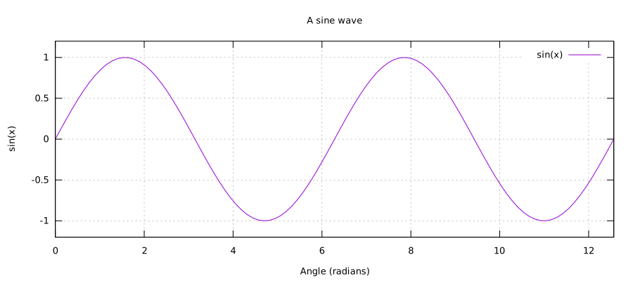
Check: Two peaks are visible, with the same heights as before.
Discuss: Did you change the function or only the part of it that is visible?
Show solution and discussion
Worked solution Intro A — Change the visible range
Change only the range to set xrange [0:4*pi], then replot in the
same interactive session. In Org, edit that line in the complete block
and rerun it. Listing 2 is the full checkpoint;
it also works in a fresh gnuplot process.
reset
set title "A sine wave"
set xlabel "Angle (radians)"
set ylabel "sin(x)"
set xrange [0:4*pi]
set yrange [-1.2:1.2]
set grid
plot sin(x)
Only the visible interval changes; the function and amplitude do not.
Two peaks should be visible. Restore set xrange [0:2*pi] before continuing.
solution-intro-range.svg)Challenge Intro B — Change the drawing style (2 min)
The connecting line can help a reader see an ordered progression, but the table still contains just six positions. Compare what the two views suggest.
Start: Org synthetic table · Terminal synthetic table. Use the intro-linespoints continuation from the same chapter.
- Switch from linespoints back to points without changing any values or columns.
- Explain what the connecting line adds, then restore linespoints.
Hint: Change the drawing style after with; keep using 1:2.
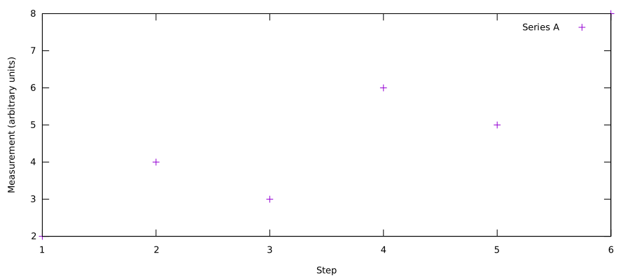
Check: The same six positions appear, with no connecting segments.
Discuss: When would joining points imply a relationship that the data do not support?
Show solution and discussion
Worked solution Intro B — Change the drawing style
Replace with linespoints with with points, as in listing
3. This is a replacement plot line, not a
standalone script. Keep the synthetic data block and axis labels from
the linked intro-data example. In Org, replace its final line and run
the complete block; in the same gnuplot prompt, enter the replacement line.
plot $Measurements using 1:2 with points title "Series A"
The six positions stay fixed. Connecting them suggests an ordered progression;
it does not add measurements between the steps. Use lines only when that
connection is meaningful. Restore with linespoints afterwards.
solution-intro-style.svg)Challenge Intro C — Add a second series (3 min)
Two measurements taken at the same steps can share one set of axes. Use the remaining table column without removing the first series.
Start: Org synthetic table · Terminal synthetic table. Start from its one-series linespoints version.
- Add column 3 to the chart. Keep column 1 as the horizontal coordinate for both series.
- Name the new series “Series B”. Keep Series A and the units unchanged.
Hint: Separate the two series with a comma in one plot command; give each its own title.
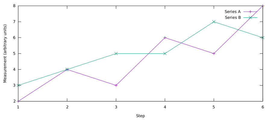
Check: At step 6, Series A is 8 and Series B is 6. The legend distinguishes them.
Discuss: Why is sharing these axes appropriate for these two synthetic series?
Show solution and discussion
Worked solution Intro C — Add a second series
Replace the final plot line in intro-data with listing
4. Keep the complete synthetic table and axis
labels; the snippet needs that data block. In Org, rerun the complete
block. In the same interactive session, enter the replacement command.
plot $Measurements using 1:2 with linespoints title "Series A", \
     $Measurements using 1:3 with linespoints title "Series B"
The comma adds a second plot item; the backslash continues the command on the next line. Only the second y column and its legend entry differ. Both measurements have the same arbitrary units and the same step values. At step 6, the endpoints are 8 and 6, respectively.
solution-intro-series.svg)1 — Download and inspect the data
Challenge 2 — Match a question to a dataset (5 min)
Imagine a colleague asks for three different views of the Titanic records. The tempting response is to start plotting immediately. First choose a table whose rows and columns actually answer the question. This small pause prevents a polished chart from comparing the wrong populations.
Start: Org listing titanic_by_class · Terminal listing inspect-class-table.
Data: titanic_by_class.csv, titanic_by_sex.csv, titanic_by_age_and_class.csv.
- Choose the published dataset for each question: people aboard by class; women's versus men's survival; survival by age and class.
- Check that survived plus died equals aboard for Crew. Then use the sex summary to check that the two Crew aboard counts give the same total.
- Inspect an empty age/class row. Explain why its survival value is NA rather than zero.
Hint: Read column headers before choosing a numerator or denominator. All summaries are already published; do not regenerate them.
Check: Three dataset choices, one count check, and a sentence distinguishing missing rates from observed zero.
Discuss: Why can a zero count be meaningful while a percentage for that same empty group is undefined?
Show solution and discussion
Worked solution 2 — Match a question to a dataset
Choose titanic_by_class.csv for totals by class/Crew,
titanic_by_sex.csv for the within-class sex comparison, and
titanic_by_age_and_class.csv for the age/class grid.
For Crew, 211 + 679 = 890 checks outcomes. In the sex summary,
23 + 867 = 890 checks the two aboard counts. The two tables describe the
same total using different columns; neither calculation uses survivor
counts as its denominator.
The row with age label 1 and class code 4 has n=0, survivors=0 and
survival_pct=NA. There is no observed survival rate because its
denominator is zero. Compare that with the age label 49 / third-class row:
9 people and 0 survivors give an observed 0%. Do not turn the empty group's
NA into a numerical zero merely to make the plot look complete.
2 — A first plot
Challenge 3 — Ask the first plot a different question (4 min)
Your first chart answers “How many people were aboard?” Now someone asks “How many survived?” Most of the plotting machinery can stay. Your job is to change the measurement while keeping the words around the figure truthful. Predict which bars will shrink most before you run it.
Start: Org listing plot-by-class-table · Terminal by_class_aboard.gp.
Data: titanic_by_class.csv.
- Change the aboard plot to show survivors. Keep all four category labels, including Crew.
- In Org, change the remote table formula to use column 3 and rename the table's value heading. In the terminal script, change the selected value column.
- Update the figure's wording so a reader can tell what is being counted.
Hint: Survived is column 3; column 1 supplies the category. In Org, copy the literal table example into the buffer before recalculating and plotting it.
Check: A survivors plot with four labelled bars and an accurate heading or title.
Discuss: Which parts of the figure changed automatically, and which labels did you have to update yourself?
Show solution and discussion
Worked solution 3 — Ask the first plot a different question
In the terminal script, replace its plot line with listing
5. Keep its CSV setup, histogram style and
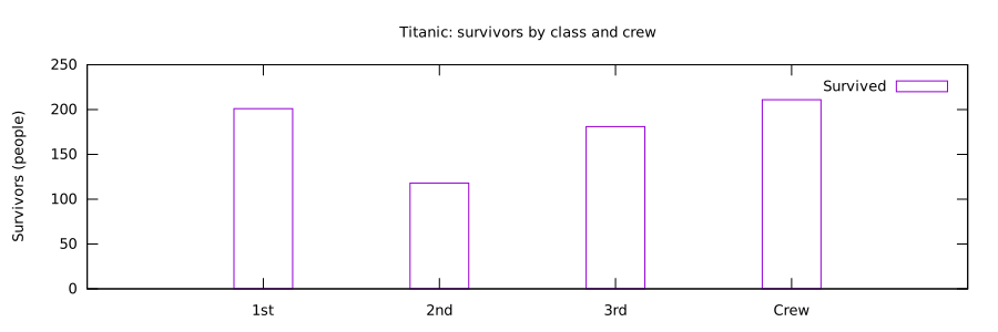
output settings. Survivor counts should be 201, 118, 181 and 211 in the
original category order.
set title "Titanic: survivors by class and crew"
set ylabel "Survivors (people)"
plot data using 3:xtic(1) title "Survived"
For the native Org table, replace the value heading with Survived and
change the remote field to column 3 as in listing 6.
Copy these lines into the buffer as native Org text, not inside an
executable Bash or gnuplot block. Recalculate the formula with C-c C-c,
then run M-x org-plot/gnuplot.
#+PLOT: ind:1 deps:(2) type:2d with:histograms
#+PLOT: set:"term svg size 900,300" set:"yrange [0:*]"
#+PLOT: file:"orgmode/figures/challenge-first-survivors.svg"
| Class | Survived |
|-------+----------|
| 1st   |      201 |
| 2nd   |      118 |
| 3rd   |      181 |
| Crew  |      211 |
#+TBLFM: $2=remote(titanic_by_class,@@#$3)
The values and bars update, but your surrounding prose is not rewritten. Third class loses the most height when switching from aboard to survivors: 709 becomes 181. This is a difference in counts, not a rate ranking.
solution-first-plot.svg)3 — One series, minimal code
Challenge 4 — Give bars an honest baseline (3 min)
A minimal plot is useful for checking whether data can be drawn. A reader, however, should not have to see the code to understand a bar. Give this first sketch enough context to stand alone, without adding decorative elements that compete with its message.
Start: Org listing fig-2 · Terminal by_class_survivors.gp.
Data: titanic_by_class.csv.
- Identify the explicit zero lower limit in the survivor plot's vertical range.
- Label the vertical axis and add a short title. Compare with the original minimal plot.
Hint: Use set yrange, set ylabel and set title. Keep the original data and column selection.
Check: A plot whose baseline, measurement and population a partner can identify without seeing its code.
Discuss: Could someone mistake these bars for survival percentages? What prevents that misunderstanding?
Show solution and discussion
Worked solution 4 — Give bars an honest baseline
Insert listing 7 immediately before the existing
survivor plot statement. Keep the value column unchanged.
set yrange [0:*]
set ylabel "Survivors (people)"
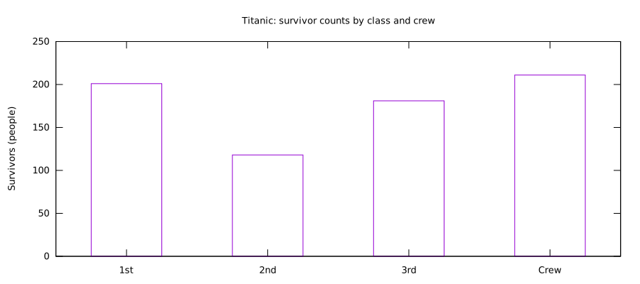
set title "Titanic: survivor counts by class and crew"
The lower bound is explicitly zero; * lets gnuplot choose the upper bound.
The starting plot already includes this range, so keep it rather than
adding a second range command: an honest baseline belongs in the first sketch.
The words “counts” and “people” distinguish these values from percentages.
A reader can now identify the quantity without inspecting using 3.
solution-one-series.svg)4 — Two outcomes, readable labels
Challenge 5 — Check two series against their total (4 min)
Two series share one category axis, but each bar has its own meaning. Treat the CSV row as a small accounting identity: survivors and people who died together account for everyone aboard in that group. Use that identity to check the chart, not just its appearance.
Start: Org listing fig-3 · Terminal by_class_counts.gp.
Data: titanic_by_class.csv.
- Temporarily remove the deaths series, rerun, then put it back after a comma.
- Rename the two legend entries to Survived and Did not survive.
- Choose one class and verify that the two bar values add to its aboard count.
Hint: A comma separates plot items; the second item can reuse the input with two single quotes.
Check: A two-series plot and one written arithmetic check using the matching CSV row.
Discuss: If a series disappears without an error, how would you distinguish a plotting mistake from a genuine zero?
Show solution and discussion
Worked solution 5 — Check two series against their total
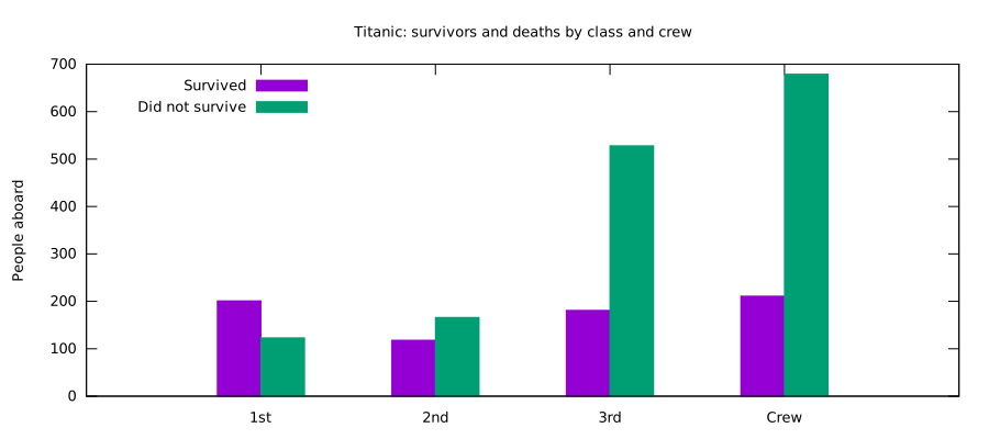
Replace the two-series plot statement with listing 8.
The empty filename reuses the same input, and the comma separates the series.
plot data using 3:xtic(1) title "Survived", \
     '' using 4 title "Did not survive"
For first class, 201 + 123 = 324; for Crew, 211 + 679 = 890.
These checks agree with column 2 of the class summary. When removing the
second series temporarily, also remove the first line's trailing comma
and continuation backslash. Restore both when adding the series back.
A missing series is not evidence of zero deaths: first inspect the plot
items and the corresponding CSV column.
solution-grouped.svg)5 — Make the appearance deliberate
Challenge 6 — Make one visual change at a time (4 min)
You are preparing a figure for a handout rather than an interactive screen. Colour and legend position should help readers distinguish outcomes without covering the evidence. Try a deliberate, restrained change, then ask a partner whether it actually made the chart easier to read.
Start: Org listing fig-4 · Terminal by_class_styled.gp.
Data: titanic_by_class.csv.
- Choose a new survivors' colour and keep deaths neutral. Move the legend where it does not cover data.
- Compare before and after. Check that the legend colours still identify the correct outcomes.
Hint: Change the relevant linetype or colour setting and the key position; do not change the using expressions.
Check: Two comparable figures and a sentence explaining your readability choice.
Discuss: Would the legend still make sense to someone who saw the earlier chapter's colours?
Show solution and discussion
Worked solution 6 — Make one visual change at a time
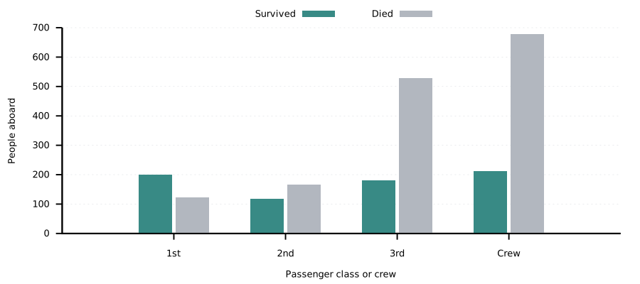
One defensible choice is a muted green for survivors and neutral grey for
deaths. Insert listing 9 before plot, after
the existing appearance settings, so the new settings take effect.
set linetype 1 lc rgb "#237d78"
set linetype 2 lc rgb "#aab0b8"
set key outside top center horizontal
The legend now sits outside the plotting area, so it cannot cover a tall bar. The data and bar heights are unchanged. Other colours or a clear in-plot legend position can also be valid: assess legibility and accurate series labels, not whether the student's colour matches this example. Because earlier plots used blue for survivors, describe the change rather than assuming that colour has a permanent meaning across the course.
solution-appearance.svg)6 — Reuse the shared style
Show solution and discussion
Worked solution 7 — Change a shared setting once
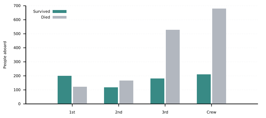
Replace only the linetype-1 colour definition in plot-style (Org) or
style.gp (terminal) with listing 10.
Rerun fig-5 and fig-6a in Org. The named style block itself is not
executed: Noweb expands it into the plotting blocks. In the terminal,
save the style and run listing 11.
Both survivor series should change. If just one changes, check whether
that plot loads the edited style, overrides linetype 1 afterwards, or
shows a cached image. Restore #14507d and rerun both. This exercise is
about one definition reaching two outputs, not copying the same setting
into two scripts.
solution-shared-by_class_shared.svg)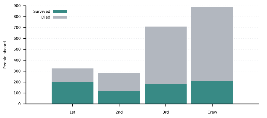
solution-shared-by_class_stacked.svg)7 — Stacked counts including crew
Challenge 8 — Choose between stacked and grouped counts (4 min)
A plot can answer two questions with the same numbers: “Which group was largest?” and “Which group had more survivors?” Stacking makes one comparison convenient and another less direct. There is no universally best version; choose an arrangement for a specific reading task.
Start: Org listing fig-6a · Terminal by_class_stacked.gp.
Data: titanic_by_class.csv.
- Change rowstacked to clustered and rerun the counts plot.
- Decide which version makes total group sizes easier to compare, and which makes survivor counts easier to compare.
- Use Crew and first class to support your answer with values from the dataset.
Hint: The data are unchanged: only the way bars share their baseline changes.
Check: Both plot versions and two short comparison sentences.
Discuss: Which segments share a common baseline in each version, and why does that matter?
Show solution and discussion
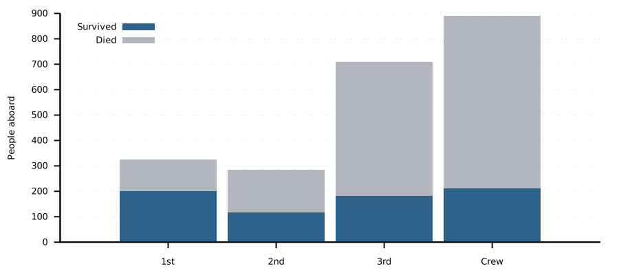
Worked solution 8 — Choose between stacked and grouped counts
Replace set style histogram rowstacked with listing
12, leaving the count expressions alone.
set style histogram clustered
Crew has 890 people (211 survived, 679 died); first class has 324 (201 survived, 123 died). In the stacked view, each complete bar reaches its group's aboard total. In the clustered view, both outcome series start at zero, making comparisons of either outcome more direct. The survivor segments already have a common baseline when they are the bottom stack; the upper death segments do not. A good answer notices this rather than claiming that every stacked comparison is equally difficult.
by_class_outcomes_stacked.svg)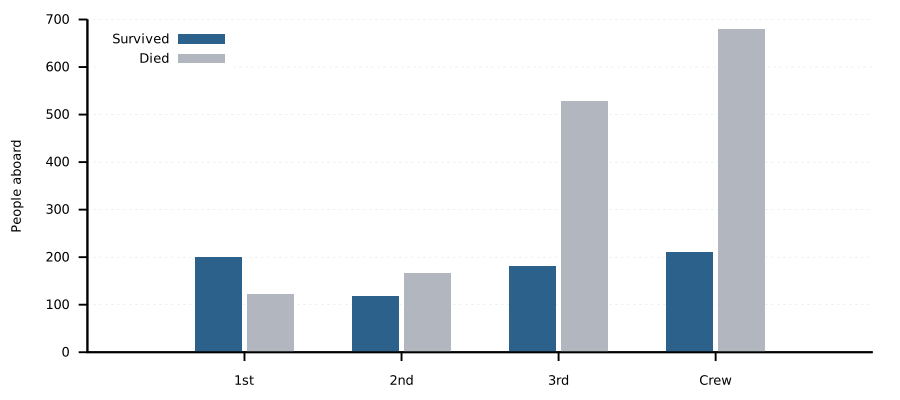
solution-stacked.svg)8 — One hundred percent stacks
Show solution and discussion
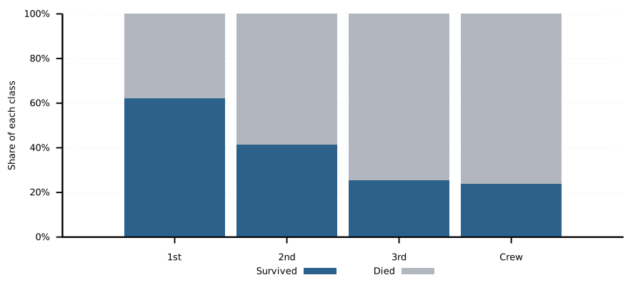
Worked solution 9 — Distinguish a share from a count
The essential expressions are shown in listing 13. Both outcomes divide by column 2 of their own row.
For first class, 201/324*100 is about 62.037% and 123/324*100 is
37.963%; together they make 100%. Crew is the largest group by count
(890), while first class has the highest survival rate (62.0%).
A suitable caption is: “Each complete bar represents all people in that class or Crew group; the segments show the percentage who survived or died.” Equal total bar heights do not mean equal sample sizes. To assess how much evidence underlies a rate, supply the aboard counts alongside it.
solution-shares.svg)9 — Rates with exact labels
Challenge 10 — Decide how much precision to show (4 min)
A label such as 23.7% appears more precise than 24%, although both can describe the same plotted bar. You are choosing how much detail to display, not changing the observations. Compare the two versions at the size at which students will actually read them.
Start: Org listing fig-6c · Terminal by_class_survival_rate.gp.
Data: titanic_by_class.csv.
- Change the percentage labels from one decimal place to whole percentages.
- Compare the two versions for third class and Crew. Does the ordering change? What information is hidden by rounding?
- Keep a 0-100 percentage axis and make the title describe survival rates, not survivor counts.
Hint: Adjust the sprintf format in the labels layer; do not round the data or the bar-height expression.
Check: A whole-percentage plot and a one-sentence justification for your preferred label precision.
Discuss: When is an extra decimal informative, and when does it merely add visual clutter?
Show solution and discussion
Worked solution 10 — Decide how much precision to show
Replace the existing two-layer plot statement with listing
14. Only the label format changes; bar heights and
label positions still use the unrounded ratio.
plot data using 0:($3/$2*100):xtic(1) with boxes notitle, \
     data using 0:($3/$2*100):(sprintf("%.0f%%", $3/$2*100)) \
          with labels offset 0,0.5 notitle
The labels become 62%, 42%, 26% and 24%. Third class changes from 25.5%
to 26%; Crew changes from 23.7% to 24%. Their ordering is unchanged,
but part of the approximately 1.821-percentage-point gap is hidden.
Keep the existing set yrange [0:100]. Whole percentages are reasonable
for a small overview; one decimal is useful when discussing close rates.
Neither label format adds certainty to the underlying data.
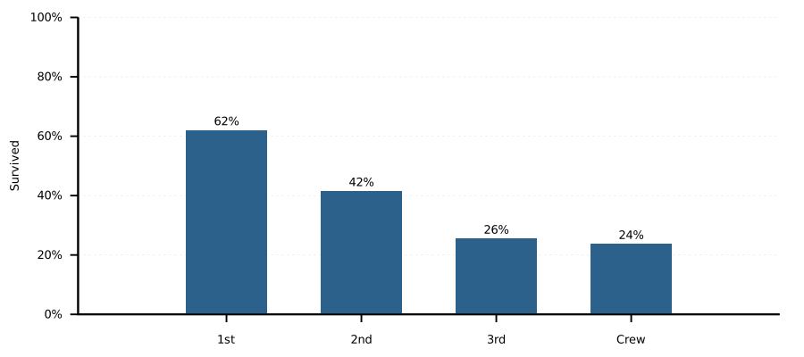
solution-rates.svg)10 — Class and sex
Challenge 11 — Compare within a group (5 min)
A group can contain many more men than women, so comparing survivor counts alone does not compare survival rates. Crew is a useful test: the two denominators are very different. Keep the denominator attached to its own numerator while you reorder the visual presentation.
Start: Org listing fig-6d · Terminal by_class_and_sex.gp.
Data: titanic_by_sex.csv.
- Calculate the difference between women's and men's survival rates for Crew, in percentage points.
- Verify that each rate uses its own sex-specific aboard count.
- Swap the display order of the two series, keeping each series' colour and legend meaning together.
Hint: Women use columns 3/2; men use 6/5. Subtract percentages, not survivor counts.
Check: A reordered plot and the Crew percentage-point gap with its two denominators.
Discuss: Why is a difference in percentage points easier to interpret here than a difference in survivor counts?
Show solution and discussion
Worked solution 11 — Compare within a group
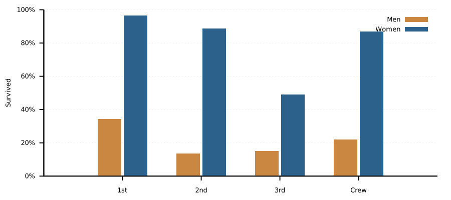
For Crew, women have 20/23*100 = 86.9565% survival and men have
191/867*100 = 22.0300%. The difference is about 64.9 percentage points.
The denominators are 23 and 867, not the combined Crew total.
Replace the plot statement with listing 15. Explicit
linetypes keep men orange and women blue even after reversing their order.
plot sex using ($6/$5*100):xtic(1) title "Men" lt 2, \
     sex using ($3/$2*100) title "Women" lt 1
Relying on automatic series order would otherwise assign the first style to men. Reversing the display does not change either rate or the gap. There are more male survivors in absolute terms (191 versus 20), yet a much smaller fraction of the male Crew group survived. This is why a rate comparison needs the matching denominators.
solution-sex.svg)11 — A pie with circles
Challenge 12 — Give the slices names and percentages (7 min; optional extension)
Your first pie has four slices, but its colours do not tell a reader who they represent. Keep the short geometry code and add one layer of text: each slice should name its group and its share of everyone aboard. Separate drawing the shapes from making the result understandable.
Start: Org listing fig-7a · Terminal by_class_pie.gp.
Data: titanic_by_class.csv.
- Keep the aboard counts and slice boundaries unchanged. Choose the optional darker report palette if using white text. Add a second
plotitem usingwith labels. - Place each label halfway through its slice's angle, at radius 0.62. Show the class or Crew name and the percentage of all 2,207 people aboard.
- Reset
angle_endbefore the label pass. Check the four labels against the table, then choose a readable font size and text colour.
Hint: The middle angle is the slice's start plus half of angle_for_count($2). With angles in degrees, x = r*cos(mid) and y = r*sin(mid) place the text. Use strcol(1) for the name and sprintf to format the percentage; \n starts a new line and %% prints a percent sign.
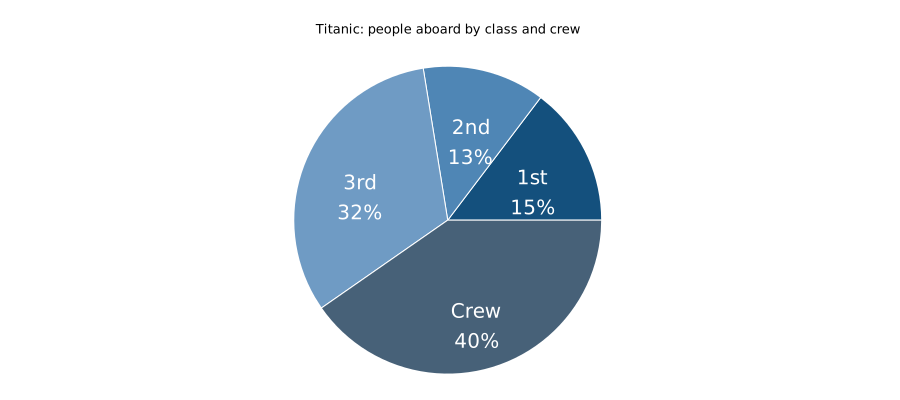
Check: The same four slices, now labelled 1st 15%, 2nd 13%, 3rd 32% and Crew 40%. These are shares of people aboard, not survival rates.
Discuss: Why must the label pass start at the same angle as the slice pass? What becomes unclear if you share only the unlabelled image?
Optional extension — Change the whole (4 min): Make the labelled pie describe deaths instead. Use column 4 consistently for the total, angles and percentages, and update the title. Explain why Crew's share of all deaths is not Crew's probability of dying. The whole is different even though the category names stay the same.
Show solution and discussion
Worked solution 12 — Give the slices names and percentages
First: label everyone aboard. Keep the input, output, ranges and total
from the lesson. Apply its optional darker report palette for white text.
Replace only its final plot command with listing
16. Use a new output filename in your working copy.
The first pass still draws the original slices; the second draws the text.
set linetype 1 linecolor rgb "#14507d"
set linetype 2 linecolor rgb "#4f86b5"
set linetype 3 linecolor rgb "#6f9bc4"
set linetype 4 linecolor rgb "#476178"
label_radius = 0.62
plot angle_end = 0, \
     data using (0):(0):(1):(angle_end): \
       (angle_end = angle_end + angle_for_count($2)):($0+1) \
       with circles lc variable notitle, \
     angle_end = 0, \
     data using \
       (angle_end = angle_end + angle_for_count($2), \
        label_radius*cos(angle_end - angle_for_count($2)/2)): \
       (label_radius*sin(angle_end - angle_for_count($2)/2)): \
       (sprintf("%s\n%.0f%%", strcol(1), $2*100.0/total)) \
       with labels center tc rgb "white" font ",20" notitle
This optional extension combines several concepts: trigonometry locates
text, a running angle follows the slices, and sprintf formats the label.
It is not needed to draw the pie. The label expression first advances
angle_end by this slice's width. Subtracting half that width gives the
middle angle, used for both x and y. The comma expression performs one
update, then returns the x coordinate; y reads the already updated end.
Resetting angle_end makes both passes start at zero rather than depending on
a leftover full turn. set angles degrees in the lesson also governs
cos and sin.
At radius 0.62, labels stay inside the unit circle. The smallest slice is second class, about 13%; verify that both lines fit without crossing its edges. Rounding changes the printed percentages, not the original slice angles.
solution-pie-labels.svg)Optional extension: use deaths as the whole.
Use deaths for every count that contributes to the total, an angle or a
label. Listing 17 replaces the original script from
stats through the final plot; keep its input, terminal and output setup.
The added coordinate reset makes this recipe safe even after
an earlier polar plot.
unset polar
set autoscale
stats data using 4 nooutput
total = STATS_sum
set angles degrees
ang(n) = n * 360.0 / total
set title "Titanic: deaths by class and crew"
unset border
unset tics
unset grid
unset key
set size ratio -1
set xrange [-1.05:1.05]
set yrange [-1.05:1.05]
set style fill solid 1.0 border lc rgb "white"
set linetype 1 lc rgb "#14507d"
set linetype 2 lc rgb "#4f86b5"
set linetype 3 lc rgb "#6f9bc4"
set linetype 4 lc rgb "#476178"
label_radius = 0.72
plot pos = 0, \
     data using (0):(0):(1):(pos): \
       (pos = pos + ang($4)):(column(0)+1) \
       with circles lc variable notitle, \
     pos = 0, \
     data using \
       (mid = pos + ang($4)/2, pos = pos + ang($4), label_radius*cos(mid)): \
       (label_radius*sin(mid)): \
       (sprintf("%s %.0f%%", strcol(1), $4*100.0/total)) \
       with labels center tc rgb "white" font ",16" notitle
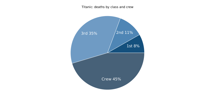
The whole is 1,496 deaths. Wedge shares are approximately 8.2%, 11.1%,
35.3% and 45.4% for first, second, third class and Crew. Crew's death
share is 679/1496; its within-group death rate is 679/890 = 76.3%.
Those answer different questions.
The compact one-line labels fit the smaller death-share wedges; two-line
labels at the original font size cross the first-class slice boundary.
Whole-percentage wedge labels can sum to 99% because of rounding; the
wedge angles still use the original counts and fill the complete circle.
solution-pie.svg)12 — Heatmaps and age panels
Challenge 13 — Read the same rates in two encodings (4 min)
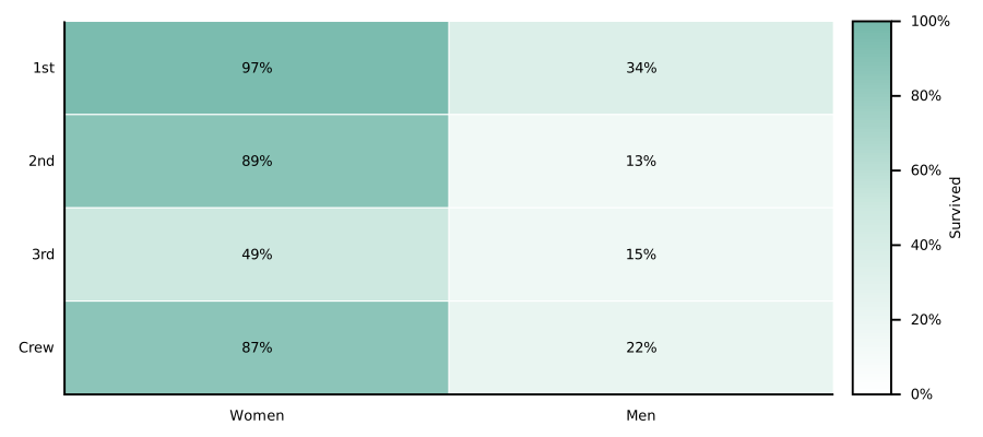
The grouped bars and the small heatmap contain the same eight survival rates. One uses height; the other uses colour. Changing the palette is a chance to test whether the ordering is still easy to read and whether exact labels remain useful.
Start: Org listing fig-7b · Terminal by_class_and_sex_heatmap.gp.
Data: titanic_by_sex.csv.
- Choose a new sequential colour palette, retaining the 0-100 colour scale.
- Find the highest and lowest rate cells. Match them to the grouped bars from chapter 10.
- Check that every numeric label remains readable against its cell colour.
Hint: Palette changes affect appearance, not the percentages. Keep cbrange fixed when comparing versions.
Check: A recoloured heatmap and two matched class/sex groups with their rates.
Discuss: Which version helps you compare two nearby rates, and which helps you scan for an overall pattern?
Show solution and discussion
Worked solution 13 — Read the same rates in two encodings
A light sequential palette with dark labels is one valid answer. Insert listing 18 after the original palette settings and before the plot. The numeric range stays fixed.
set palette defined (0 "#ffffff", 50 "#cce8df", 100 "#75b9ab")
set cbrange [0:100]
The highest rate is first-class women: 139/144*100 = 96.5%.
The lowest is second-class men: 24/178*100 = 13.5%.
They match the corresponding grouped bars. The heatmap's original
whole-percentage labels round those values to 97% and 13%, so compare
the underlying rates rather than expecting identical label precision.
Colour is useful for scanning a pattern; position against a scale is
usually easier for a precise two-value comparison. Other readable
sequential palettes are acceptable.
solution-heatmaps.svg)Challenge 14 — Show when a percentage has little support (7 min)
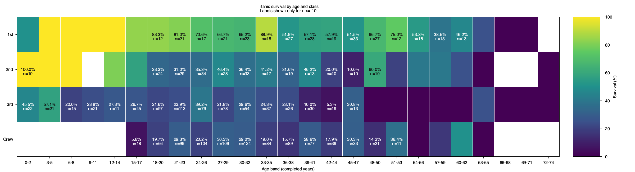
A bright cell can mean one survivor out of one person or many survivors in a much larger group. The colour alone does not tell you. Explore a simple labelling rule that reduces clutter while retaining the underlying cells. The threshold is a display choice, not a statistical guarantee.
Start: Org listing titanic-survival-heatmap · Terminal by_age_and_class_heatmap.gp.
Data: titanic_by_age_and_class.csv.
- In the large heatmap's labels layer, show text only for cells with at least 10 people. Keep the coloured-cell layer unchanged.
- Find a blank cell with n=0 and an observed cell with 0% survival. Explain the difference.
- Add a title or caption note stating that labels are hidden for n below 10.
Hint: Column 4 is n. Use a conditional string expression around sprintf: condition ? label : "". Hidden labels do not remove observations.
Check: A heatmap with selective labels and a note distinguishing empty groups from small observed groups.
Discuss: What could a reader wrongly infer if you hid small-group labels without explaining the rule?
Show solution and discussion
Worked solution 14 — Show when a percentage has little support
Replace the large heatmap's complete plot statement with listing
19, including the explanatory title above it.
The rectangle expression is unchanged; only the text returned by the
labels expression becomes conditional.
set title "Titanic survival by age and class\nLabels shown only for n >= 10"
plot data using 1:2:($1-1.5):($1+1.5):($2-0.5):($2+0.5):3 \
        with boxxyerror linecolor palette, \
     data using 1:2:($4 >= 10 ? sprintf("%.1f%%\nn=%d", $3, $4) : ""): \
        ($3 >= 55 ? 0x111111 : 0xffffff) \
        with labels textcolor rgb variable font "Sans,12"
Crew at age label 1 (ages 0-2) has no records: n=0 and NA.
Third class at label 49 (ages 48-50) has 9 records and no survivors:
that is a measured 0%. Its colour remains visible, but its text disappears
under the new rule. Removing a label neither removes a person from the
data nor turns an estimate into a reliable one. The threshold of 10 is
an illustrative presentation choice, not a confidence criterion.
solution-age-heatmap.png)Challenge 15 — Do lines imply more than the data show? (5 min)
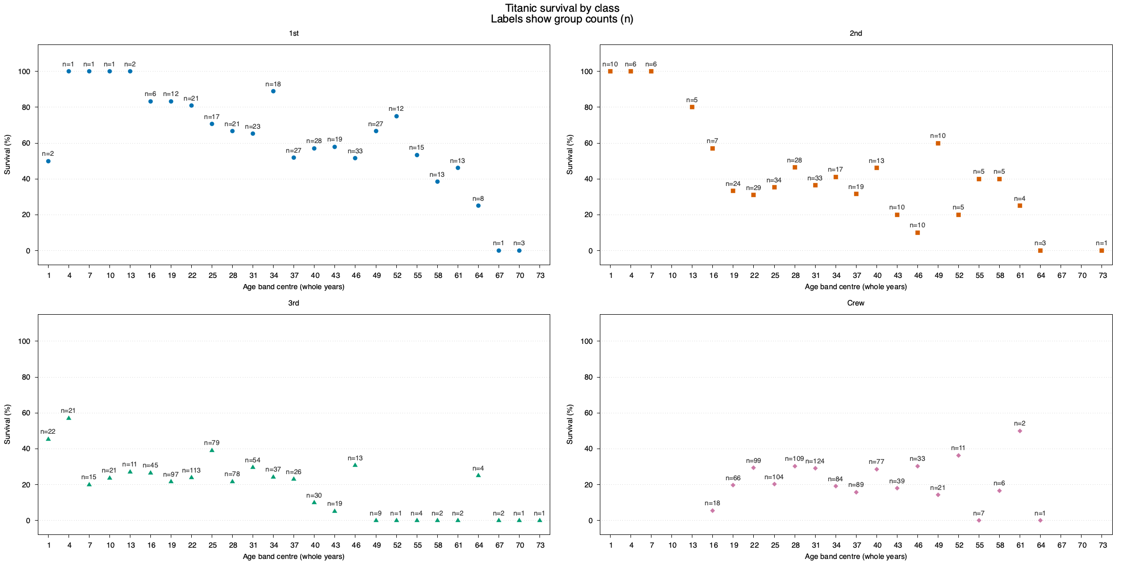
Lines encourage the eye to follow a continuous story. Here, however, each point summarises a different three-year age group, and some groups are empty or very small. Remove the joining lines and decide how that changes your confidence in the apparent age pattern.
Start: Org listing titanic-survival-panels · Terminal by_age_and_class_panels.gp.
Data: titanic_by_age_and_class.csv.
- Replace linespoints with points in all four panels; keep the count labels and common axes.
- Compare Crew in the original and modified versions. Locate an empty age band and one with a small positive count.
- Explain what joining age-band estimates with lines might suggest to a reader.
Hint: These are group percentages, not individual trajectories. Do not replace NA with zero.
Check: A points-only panel figure and one sentence about the limits of connecting grouped estimates.
Discuss: Does an empty age band mean that nobody survived, or that this dataset contains nobody in that group?
Show solution and discussion
Worked solution 15 — Do lines imply more than the data show?
Inside the existing multiplot setup, replace the do for loop with
listing 20. Keep the edition's existing
header_rows setting and the unset multiplot statement after the loop.
do for [c=1:4] {
    set title word(classes,c)
    plot data every 4::(header_rows+c-1) using 1:3 \
        with points linestyle c pointsize 1.1, \
      data every 4::(header_rows+c-1) using 1:3:(sprintf("n=%d", $4)) \
        with labels offset char 0,1 textcolor rgb "#333333" font "Sans,10"
}
For Crew, ages 66-68 (label 67) are empty; ages 63-65 (label 64) contain one person and no survivors. The former has no plotted rate; the latter has an observed rate of zero. Points emphasise the separate group summaries. Lines can suggest a smooth relationship or an intermediate value that was not observed; they do not turn these different people into a cohort followed over time.
solution-age-panels.png)13 — A dumbbell chart
Challenge 16 — Add an honest name for the gap (5 min)
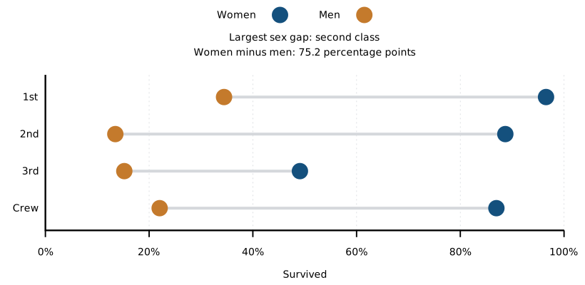
The dumbbell chart makes the distance between two rates the main visual feature. Give that distance a precise interpretation: percentage points between women's and men's survival within the same group. Calculate before writing the headline, then use another chart as a cross-check.
Start: Org listing fig-7c · Terminal by_class_sex_gap.gp.
Data: titanic_by_sex.csv.
- Use the endpoint values to find the class or Crew group with the largest women's-minus-men's survival gap.
- Calculate that gap in percentage points and add it to the plot title.
- Check the result against the same group's bars in chapter 10.
Hint: Subtract 100 times column 6/5 from 100 times column 3/2. Percentage points are not relative percent change.
Check: An annotated dumbbell plot and the calculation supporting its title.
Discuss: Would reversing the subtraction change the size of the gap, its sign, or both?
Show solution and discussion
Worked solution 16 — Add an honest name for the gap
The largest women's-minus-men's gap is in second class:
94/106*100 - 24/178*100 = 75.1961 percentage points.
First class is about 62.1 points, third class 33.9 and Crew 64.9.
Insert listing 21 before its plot statement.
set title "Largest sex gap: second class\nWomen minus men: 75.2 percentage points"
The second-class bars in chapter 10 are about 88.7% for women and 13.5% for men, which agrees. Subtracting already-rounded display labels may differ slightly from calculating directly from the counts; use the counts for the result. Reversing the subtraction changes the sign, not the absolute distance. “75.2% higher” would describe a different, relative comparison and is not an accurate substitute for this title.
solution-dumbbell.svg)14 — Five measures on a spider plot
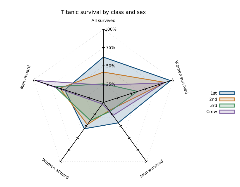
Challenge 17 — Test whether polygon shape is evidence (6 min)
Spider plots look like distinctive shapes, which makes it tempting to treat a larger polygon as a better outcome. Test that intuition by rearranging axes while holding all values fixed. Your edit must keep each axis label paired with the expression it describes.
Start: Org listing fig-7d · Terminal by_class_profile.gp.
Data: titanic_by_sex.csv.
- Exchange the two plot clauses for women's and men's survival rates. Exchange the corresponding paxis labels too.
- Compare the old and new polygons without changing any values or the 0-100 axis ranges.
- Name the two axes that describe group composition rather than survival.
Hint: Axis order affects polygon shape and area. Keep the clauses and axis labels paired when reordering them.
Check: Two profile plots and a sentence explaining why polygon area is not a survival score.
Discuss: Can a shape that depends on axis order be used as an overall survival score?
Show solution and discussion
Worked solution 17 — Test whether polygon shape is evidence
Replace the five-clause plot statement with listing
22, applying its two label changes immediately before
the plot. Keep the first, fourth and fifth axes, all ranges and the
remaining appearance settings unchanged.
set paxis 2 label "Men survived" rotate by -72
set paxis 3 label "Women survived" rotate by 36
plot sex using (($3+$6)/($2+$5)*100):key(1) with spiderplot notitle, \
     sex using ($6/$5*100) with spiderplot notitle, \
     sex using ($3/$2*100) with spiderplot notitle, \
     sex using ($2/($2+$5)*100) with spiderplot notitle, \
     sex using ($5/($2+$5)*100) with spiderplot notitle
The polygon changes because different values now sit beside each other. No rate or count changed. The last two axes describe women's and men's shares of everyone aboard within a class/Crew group; those shares sum to 100%. They are not survival probabilities. Polygon area mixes these different measures and depends on their order, so it is not an overall survival score. Accept a clear explanation of this dependency, not a judgement about which polygon looks “best”.
by_class_profile_spider.svg)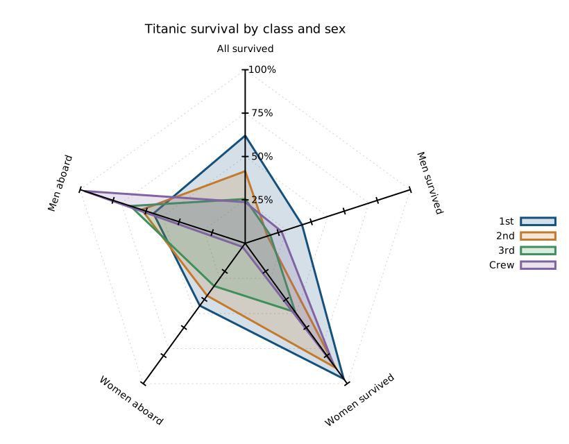
solution-spider.svg)15 — Class size and fate in a donut
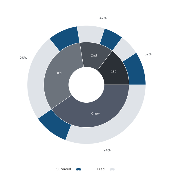
Challenge 18 — Separate decoration from information (4 min)
The donut combines two ideas: how large each group was and what happened within it. Its hole is a design choice, not another measurement. Make one geometric edit and practise explaining the two rings without letting the decorative form obscure their different meanings.
Start: Org listing fig-7e · Terminal by_class_donut.gp.
Data: titanic_by_class.csv.
- Change
hole_radiusfrom 0.40 to 0.30. Leave the data expressions,split_radiusandouter_radiusunchanged. - Write one sentence describing the inner ring and another describing the outer ring.
- Choose whether the donut or stacked bars better supports an exact comparison of death counts, and explain why.
Hint: The inner sectors start at hole_radius and have width split_radius - hole_radius. There is no white disc. The label-radius formula recentres the text automatically.
Check: A modified donut and two ring descriptions with their respective meanings.
Discuss: Would making the hole smaller justify any different claim about the Titanic records?
Show solution and discussion
Worked solution 18 — Separate decoration from information
Replace the hole_radius assignment with listing 23.
Keep the ring boundary and outer radius unchanged. The inner ring becomes
thicker and its label radius is recalculated automatically.
hole_radius = 0.30
The inner ring allocates angle by each group's share of all 2,207 people.
The outer ring splits that same group angle into survived and died.
For Crew, the inner share is 890/2207 = 40.3%; within its outer sector,
211/890 = 23.7% survived. These are different denominators.
Reducing the hole exposes more coloured area without changing either quantity. Bars against an axis are generally easier for reading exact death counts; if comparing death counts alone, grouped bars give every death bar a common baseline. A valid response separates that reading task from the donut's composition overview.
solution-donut.svg)16 — Tiny age-count bars
Challenge 19 — Make a tiny chart understandable (4 min)
A sparkline gives up axes and a legend to fit into a sentence. That makes the surrounding words part of the chart. Help a reader understand the order of the age bands, what the bar heights measure and which people are absent from this age-based summary.
Start: Org listing spark-count · Terminal by_age_counts.gp.
Data: titanic_by_age.csv.
- Find the tallest age-count bar and identify its three-year age band and count from the CSV.
- Write a sentence containing the sparkline that states its left-to-right age order and what the bar heights measure.
- Explain why the counts sum to fewer people than the class summary.
Hint: People is column 2. The sparkline omits axis labels, so the surrounding text must supply context.
Check: A contextualised sparkline, its peak band/count, and a note about unknown ages.
Discuss: What would become ambiguous if the sparkline were copied out of its sentence?
Show solution and discussion
Worked solution 19 — Make a tiny chart understandable
The largest count is 262 people in ages 21-23. The 25 age-band counts sum to 2,205, two fewer than the class summary because two people have unknown ages. Their omission is not caused by Crew: Crew is included in both summaries.
A model sentence is: “People per three-year age band
 , ordered from ages 0-2 at the left to 72-74
at the right, peak at ages 21-23 (262 people); unknown ages are excluded.”
, ordered from ages 0-2 at the left to 72-74
at the right, peak at ages 21-23 (262 people); unknown ages are excluded.”
The sentence supplies the unit, order, peak and missing-age rule that the tiny chart cannot label. Copied on its own, the sparkline would not tell a reader whether height means counts or rates, or whether the horizontal direction represents age or time. Equivalent clear wording is acceptable.

solution-spark-count.svg)17 — An inline survival trend
Challenge 20 — See what an automatic scale hides (4 min)
The same sequence can look calm or dramatic depending on its vertical range. Compare a fixed percentage scale with an automatic one, and look at the axis-free result rather than just the code. You may find little change: that observation is useful too.
Start: Org listing spark-rate · Terminal by_age_survival_rate.gp.
Data: titanic_by_age.csv.
- Replace the fixed 0-100 y range with set autoscale y and rerun the rate sparkline.
- Compare the apparent ups and downs with the fixed-scale version, then restore 0-100.
- Write a sentence explaining why the peak in the rate sparkline need not be the peak in the count sparkline.
Hint: Column 3 is a percentage, not the number of survivors. The same vertical distance can represent different changes on different scales.
Check: Two scale variants and a sentence distinguishing the two age sparklines.
Discuss: Why is it important to keep a common scale when placing several rate sparklines next to one another?
Show solution and discussion
Worked solution 20 — See what an automatic scale hides
For the temporary comparison, replace the existing range line with listing 24.
set autoscale y
These data range from 0.0% to 67.9%, so an automatically chosen scale can
use more of the available height than 0-100. The peaks may look stronger,
but their values have not increased. Exact automatic limits depend on
the axis settings; inspect GPVAL_Y_MIN and GPVAL_Y_MAX after plotting
if you want to record them. Restore set yrange [0:100] for the final
comparison and when placing several percentage sparklines side by side.
The highest rate is 67.9% at ages 3-5 (28 people), whereas the count peak is ages 21-23 (262 people, 31.3% survived). One chart asks how many people are in a group; the other asks what fraction survived. A rate peak is not a survivor-count peak.

by_age_survival_sparkline.svg)
solution-spark-rate.svg)18 — Run the complete set again
Challenge 21 — Prove that an edit reaches the output (5 min)
Reproducibility is easier to test with a visible, harmless change than with a claim that everything ran. Give one figure a temporary title, predict its output filename, and follow that change through a complete rerun. Work in a copy of the whole notebook or terminal folder for this task.
Start: Org chapter · Terminal listing file-all-gp.
Data: titanic_by_class.csv.
- Change the title of one plot in your working copy and predict which figure file should change.
- Rerun your complete sequence using the workflow in this chapter. Reopen the expected output and check the new title.
- Restore the title, rerun, and record the commands or Org actions needed.
Hint: For this task, copy the complete notebook or terminal folder, keeping its internal names and paths. In Org, include the native table plot. In the terminal, all.gp loads saved files; unsaved editor changes are invisible.
Check: A short rerun checklist, with the input script/block and output filename for your test.
Discuss: What evidence distinguishes a newly generated figure from an old file that was already present?
Show solution and discussion
Worked solution 21 — Prove that an edit reaches the output
Use a copy of the complete working directory or notebook, rather than a
renamed individual script that all.gp does not load. One simple test is to
add set title "Rerun check: class survival rates" just before the rate
plot and predict by_class_survival_rate.svg as the changed output.
Terminal: save plots/by_class_survival_rate.gp, run gnuplot -d all.gp
from the copied terminal folder, then reopen figures/by_class_survival_rate.svg.
Org: edit fig-6c, run the notebook's executable blocks with C-c C-v b,
and rerun the native table example as described in chapter 18. Reopen
by_class_survival_rate.svg.
The visible temporary title is the evidence; merely finding an existing SVG is not. Restore the previous title and repeat. Record the working directory, source block/file, execution command/action and output path. Do not use author extraction to test unsaved notebook edits: it regenerates the teaching source from the DTX, not from your experimental buffer.
19 — What the figures say
Challenge 22 — Write a claim the figure supports (5 min)
A clear chart still needs a careful sentence. Practise moving from “the blue bars are taller” to a statement that names the groups, quantities and units. Then say what the comparison does not establish. A limitation strengthens an accurate description rather than cancelling it.
Start: Org listing fig-6d · Terminal by_class_and_sex.gp.
Data: titanic_by_sex.csv.
- Choose one class or Crew group in the sex-comparison plot. Write a descriptive comparison with values and units.
- Add a limitation concerning sample size, grouping or what the data cannot establish.
- Ask a partner to identify the plotted groups and check the numbers from your sentence alone.
Hint: Say what the supplied records show. A descriptive survival difference is not evidence of a causal mechanism.
Check: A two-sentence figure caption: one supported observation and one limitation.
Discuss: Could another person check your claim against a CSV row without asking which groups you meant?
Show solution and discussion
Worked solution 22 — Write a claim the figure supports
One acceptable caption is:
Among first-class people in the supplied records, 139 of 144 women (96.5%) survived, compared with 62 of 180 men (34.4%), a difference of 62.1 percentage points. This descriptive comparison pools ages within each sex and does not establish why their survival rates differed.
This names the population, gives both numerators and denominators, uses percentages for rates and percentage points for the difference, and adds a limitation the chart alone cannot resolve. Other groups are equally valid if the numbers and units match. “Women were safer because of their sex” goes beyond what this plot establishes; a comparison of recorded outcomes is not by itself a causal explanation.
20 — Troubleshooting
Challenge 23 — Catch a plausible but wrong plot (5 min)
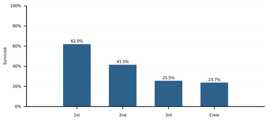
Not every wrong chart produces an error message. A valid expression can select the wrong column and still draw plausible bars. Deliberately create a disagreement between bars and labels, then use the data to diagnose it. This is a small rehearsal for checking your own future figures.
Start: Org listing fig-6c · Terminal by_class_survival_rate.gp.
Data: titanic_by_class.csv.
- In a copy of the rate plot, change the numerator of the bar-height expression from survivors to deaths, leaving the label expression unchanged.
- Rerun and explain why the chart can be wrong even though gnuplot reports no error.
- Use one CSV row to locate the mismatch, restore the numerator and verify both bars and labels.
Hint: A program can run successfully with the wrong column. Check the question, expressions, labels and input together.
Check: A diagnosis naming the incorrect column and one verified bar/label pair after repair.
Discuss: Which checks require looking at the data, rather than merely confirming that gnuplot finished successfully?
Show solution and discussion
Worked solution 23 — Catch a plausible but wrong plot
The deliberate mistake makes the first layer use 100*$4/$2 while the
labels still use 100*$3/$2. For first class, that puts the bar at 38.0%
but its survival label at 62.0%. Gnuplot is able to evaluate both valid
expressions, so successful execution cannot diagnose their disagreement.
Replace the plot with listing 25, in which both layers use the survivor numerator. Keep the percentage axis.
plot data using 0:($3/$2*100):xtic(1) with boxes notitle, \
     data using 0:($3/$2*100):(sprintf("%.1f%%", $3/$2*100)) \
          with labels offset 0,0.5 notitle
Now the first-class bar and its label both represent 201/324*100.
Check Crew as a second row: 211/890*100 = 23.7%.
A good diagnosis names the incorrect column and the intended quantity;
“the chart looked odd” is a useful warning but not yet an explanation.
solution-troubleshooting.svg)