Plots with ROOTs
Data visualization with gnuplot | Live coding with orgmode
0 — Start here
Follow one question at a time: inspect the data, make a first plot, improve its readability, then choose different charts for different questions. Both editions use the same five published CSV datasets, include crew and work through the same eighteen figures. No local AWK preparation is needed.
Begin with the independent Meet gnuplot chapter below; it needs no CSV files. Chapters 1–11 then apply the tool to counts, percentages and composition. Chapters 12–17 are chart extensions: choose them to answer a question, not because every option must be learned on the first day.
The workflow follows the ROOT principles: Robust, Open, Ongoing, Time-tested. Keep the data, plotting instructions and resulting figures understandable. Change one setting at a time and compare the result.
Use gnuplot 6.0 or newer with SVG and PNG output, and curl for downloads. Retrieve the data before an offline lesson. Once the downloads are available, all plotting can run without further network access.
Work in the Org notebook
Open this file in Emacs with Org Babel support for Bash and gnuplot. The file combines prose, data results, plotting blocks and figures. Emacs may ask whether you trust executable blocks; inspect them before approving.
| Key | Action |
|---|---|
TAB |
Fold or unfold the current heading |
C-c C-c |
Run the block or inline call under the cursor |
C-u C-c C-c |
Force a cached block to run again |
C-c C-v b |
Run the executable blocks in the buffer |
C-c C-x C-v |
Show or hide inline figures |
C-c C-c on a table formula |
Recompute the table |
If inline figures are too large, evaluate (setq org-image-actual-width '(700)).
The introduction works immediately, without downloads. In the Titanic part,
run the download blocks before the plotting blocks.
Notebook paths are relative to this file: orgmode/figures/ for plots and
orgmode/plots/ for scripts. Babel creates output folders (:mkdirp yes);
create orgmode/figures/ yourself before plotting a native Org table.
Normal notebook execution uses named Org results, not CSV files. For the
optional standalone scripts, make evaluate also retains the five downloaded
CSV responses in orgmode/data/. These are separate from the independent
dataset document's exports in data/.
Check the gnuplot build
Check gnuplot's version and both output terminals with listing 1. Continue only when the checks succeed.
#+name: check-gnuplot
#+begin_src bash
set -e
gnuplot --version
gnuplot -d -e 'if (GPVAL_VERSION < 6.0) { exit error "Need gnuplot 6.0 or newer" }; set terminal svg; print "OK: version and SVG output"'
gnuplot -d -e 'set terminal pngcairo; print "OK: PNG output"'
#+end_src
gnuplot 6.0 patchlevel 5
Practice this topic in Challenge 1: A working plotting environment.
Before Titanic — Meet gnuplot, from a first command to a simple chart
This chapter needs only gnuplot. No Titanic files, shared style or network connection is used. Start with a function; then use one small synthetic table. The short continuations below change one thing at a time. Predict the change, run it and look at the plot before proceeding.
First, draw a function
Run listing 2 with C-c C-c. Its header tells Babel where to
save the SVG; the commands between the header and end marker are gnuplot.
For this chapter, leave that technical wrapper unchanged.
#+name: intro-first
#+begin_src gnuplot :session none :file figures/introduction/first.svg :exports code :eval never-export
reset
plot sin(x)
#+end_src
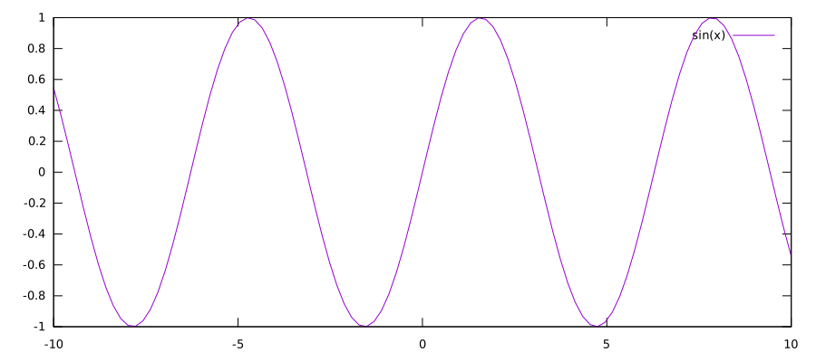
first.svg)
reset starts with known plotting settings. plot samples the built-in
function; x is its argument. Sine uses radians by default. Gnuplot chooses
the initial ranges automatically.
Optional — Smoother function curves in SVG
Gnuplot draws a function by joining calculated points. If the sine curve looks angular when you zoom in, add
set samples 500afterresetand beforeplot sin(x)in 2, then rerun the complete example. In an ongoing terminal session, change the sample count, then repeat the whole SVG export sequence: reopen the output filename,replot, and close it withunset output.show sampleschecks the active setting; a laterresetrestores the default.More samples refine the curve's geometry, not the display's pixels. Once the segments are smaller than screen pixels,
10000samples may look no better than500while producing a much larger SVG. Reopen the newly exported SVG in a browser and zoom in to distinguish straight segments from pixelated edges. This setting does not improve the character-grid resolution ofdumbor add points to ordinary tabular-data plots.
One change, then look again
Listings 3 through 8 are continuations in the same
interactive session, after 2. Enter each pair of commands
in order. set changes a setting; replot redraws the previous plot with
that setting. It does not create a plot from nothing.
In Org, these short fragments are deliberately not executable: separate
:session none blocks do not remember the previous plot. Instead, add
each new set line just before plot sin(x) in a copy of 2
and rerun that complete block. Give the copy a new block name and output
path. No persistent Babel session is needed.
#+name: intro-title
#+begin_src gnuplot :eval never
set title "A sine wave"
replot
#+end_src
#+name: intro-xlabel
#+begin_src gnuplot :eval never
set xlabel "Angle (radians)"
replot
#+end_src
#+name: intro-ylabel
#+begin_src gnuplot :eval never
set ylabel "sin(x)"
replot
#+end_src
#+name: intro-xrange
#+begin_src gnuplot :eval never
set xrange [0:2*pi]
replot
#+end_src
#+name: intro-yrange
#+begin_src gnuplot :eval never
set yrange [-1.2:1.2]
replot
#+end_src
#+name: intro-grid
#+begin_src gnuplot :eval never
set grid
replot
#+end_src
Listing 9 is the complete, independently runnable checkpoint after the six changes. It does not depend on 2.
#+name: intro-function-settings
#+begin_src gnuplot :session none :file figures/introduction/function-settings.svg :exports code :eval never-export
reset
set title "A sine wave"
set xlabel "Angle (radians)"
set ylabel "sin(x)"
set xrange [0:2*pi]
set yrange [-1.2:1.2]
set grid
plot sin(x)
#+end_src
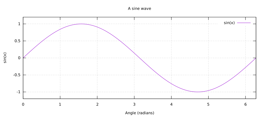
function-settings.svg)Practice this step in Intro A: Change the visible range.
One synthetic table, three numeric columns
The following six rows are synthetic, not observations. Column 1 is a step number; columns 2 and 3 are two invented measurements in arbitrary units. All later data examples in this chapter reuse this one table.
Listing 10 is another complete checkpoint. The lines between
$Measurements << EOD and EOD define a gnuplot data block: a little
table stored in memory, without a separate file. Enter the whole definition
before plotting it. Spaces separate its numeric columns.
#+name: intro-data
#+begin_src gnuplot :session none :file figures/introduction/points.svg :exports code :eval never-export :colnames no
reset
$Measurements << EOD
1 2 3
2 4 4
3 3 5
4 6 5
5 5 7
6 8 6
EOD
set xlabel "Step"
set ylabel "Measurement (arbitrary units)"
plot $Measurements using 1:2 with points title "Series A"
#+end_src
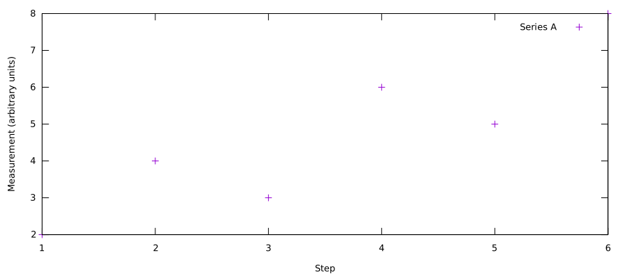
points.svg)
using 1:2 means x from column 1, y from column 2. It is not a row
range. For example, row 3 places a point at x = 3, y = 3.
title "Series A" names the legend entry, not the whole chart.
Change only the drawing style
Run 11, then 12 in the same prompt after 10. In Org, replace only the final plot line in 10 and rerun the whole block. These are replacement lines, not independent examples: the data block and axis labels must still be present.
#+name: intro-lines
#+begin_src gnuplot :eval never
plot $Measurements using 1:2 with lines title "Series A"
#+end_src
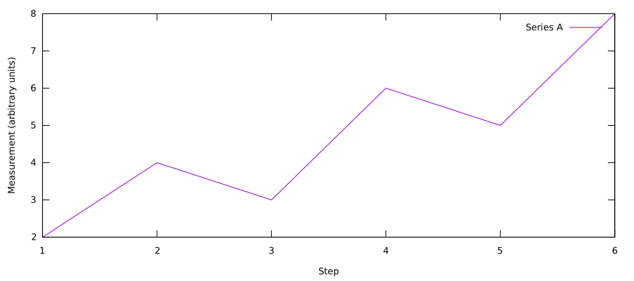
lines.svg)#+name: intro-linespoints #+begin_src gnuplot :eval never plot $Measurements using 1:2 with linespoints title "Series A" #+end_src
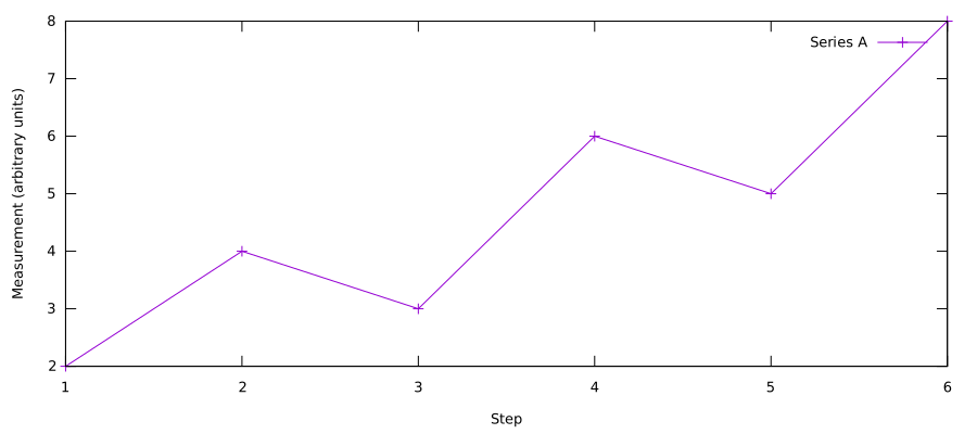
linespoints.svg)Practice this step in Intro B: Change the drawing style.
Add one series, keep the axes
Column 3 supplies a second series on the same axes, called “Series B”.
The comma separates two series in one plot command; a backslash continues
the command on the next line. Listing 13 draws both series:
replace the final plot line in 10, or enter it in that session.
#+name: intro-two-series
#+begin_src gnuplot :eval never
plot $Measurements using 1:2 with linespoints title "Series A", \
     $Measurements using 1:3 with linespoints title "Series B"
#+end_src
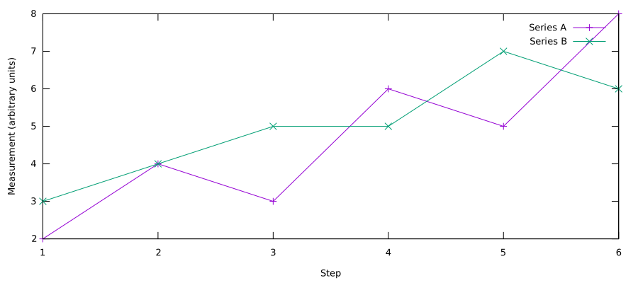
two-series.svg)At step 6, Series A is 8 and Series B is 6. Both series share the same x values. No percentages or grouping have been introduced yet.
Practice this step in Intro C: Add a second series.
Technical note — read the Babel headers when needed
Each source listing shows its name, opening header, arguments, body and
closing line. :var supplies an input table; :file names the figure;
:results controls the returned result; :exports selects the normal
Org export behaviour. This training export deliberately shows the code
and its setup beside the figures.
The shared config/course.org supplies :eval never-export and :cache no.
Gnuplot defaults are :session none, :results file graphics replace,
:colnames yes, :noweb no-export, :exports both and
:term "svg size 900,400 font 'sans,13'". Explicit block arguments override
those defaults. The donut and sparklines set their own output dimensions.
A source block labelled org is a literal syntax example, not an executable
Babel language in this course. Copy its contents into the Org buffer to
work with the native table and its directives. The author build also
recalculates and plots those examples from a temporary Org copy.
PDF export additionally needs Inkscape, LuaLaTeX and the shared style.
Use make orgmode in the DTX directory for the complete training export.
The build uses your existing font cache.
1 — Download and inspect the data
We now apply the plotting commands we already know to a real dataset. The introduction supplied the tool; from here on we ask questions about people, groups and survival. The new step in this chapter is retrieving and interpreting published columns, not calculating a new dataset.
Use Titanic Passengers and Crew: Demographics and Survival Data, version 1.0.1. This version-specific record fixes which data the lesson uses. All counting and age grouping have already been done; no conversion or preprocessing is needed.
| Published CSV | Rows | Contents and use |
|---|---|---|
titanic.csv |
2,207 | Individual records; inspect the underlying data |
titanic_by_class.csv |
4 | Class/crew counts; bars, rates, pie and donut |
titanic_by_sex.csv |
4 | Counts by class/crew and sex; comparisons, heatmap, dumbbell and spider |
titanic_by_age_and_class.csv |
100 | Three-year age/class cells; large heatmap and four panels |
titanic_by_age.csv |
25 | Three-year age groups; sparklines |
The person-level columns are class, sex, age, survived and embarked.
There are 2,207 records: 1,317 passengers and 890 crew, with 711 survivors.
The categories 1st, 2nd, 3rd and Crew appear in that order.
Crew is a separate group, not a fourth passenger class.
NA marks missing values, not zero. The two unknown ages are excluded from
age summaries, leaving 2,205 people. The dataset description documents its
provenance, transformations and limitations; these are descriptive records,
not evidence of causal effects.
Retrieve the five named results
Run the five download blocks below with C-c C-c, in order. Without
--output, curl prints each CSV and Org stores it beneath its named block.
The four summaries become Org tables automatically; Babel recognises the
comma-separated columns but does not recalculate their values.
:cache yes reuses an unchanged stored result. Once downloaded, plotting
uses those stored results. Use C-u C-c C-c on a download block to retrieve
it again. The author command make evaluate refreshes all five downloads
before running the plots.
--fail reports HTTP errors and --location follows redirects.
Where used, --silent --show-error hides the progress meter but retains errors.
Inspect individual records
Listing 14 retrieves all 2,208 lines, including the header.
Set rows=10 for a ten-line preview; restore rows=2500 for the full file.
This preview limit does not affect the four summaries or their plots.
:results output verbatim preserves raw CSV text. Its full stored result
is omitted from the training export.
#+name: titanic
#+begin_src bash :var rows=2500 :results output verbatim :exports code :cache yes
set -e
# Capture the complete response so HTTP errors cannot be hidden by head.
csv=$(curl --fail --silent --show-error --location \
  https://zenodo.org/api/records/22983324/files/titanic.csv/content)
printf '%s\n' "$csv" | head -n "$rows"
#+end_src
A short preview of the records:
class,sex,age,survived,embarked
1st,female,2,0,S
1st,female,13,1,S
1st,female,16,1,C
1st,female,16,1,S
survived is 1 for survival and 0 otherwise. Ages can be fractional;
the two missing ages remain NA. Names and identifiers are not present.
Inspect the class-and-crew counts
Run listing 15. Its named result supplies the counts used by the bar, pie and donut plots.
#+name: titanic_by_class
#+begin_src bash :results table :colnames yes :exports both :cache yes
curl --fail --silent --show-error --location \
  https://zenodo.org/api/records/22983324/files/titanic_by_class.csv/content
#+end_src
| Class | Aboard | Survived | Died |
| 1st | 324 | 201 | 123 |
| 2nd | 284 | 118 | 166 |
| 3rd | 709 | 181 | 528 |
| Crew | 890 | 211 | 679 |
Columns 2, 3 and 4 are aboard, survived and died. All ages and both sexes
are included. Every row satisfies survived + died = aboard; for Crew,
211 + 679 = 890. First class has 324 people and 201 survivors.
Inspect the class-and-sex counts
#+name: titanic_by_sex
#+begin_src bash :results table :colnames yes :exports both :cache yes
curl --fail --silent --show-error --location \
  https://zenodo.org/api/records/22983324/files/titanic_by_sex.csv/content
#+end_src
| Class | Women aboard | Women survived | Women died | Men aboard | Men survived | Men died |
| 1st | 144 | 139 | 5 | 180 | 62 | 118 |
| 2nd | 106 | 94 | 12 | 178 | 24 | 154 |
| 3rd | 216 | 106 | 110 | 493 | 75 | 418 |
| Crew | 23 | 20 | 3 | 867 | 191 | 676 |
Columns 2–4 are women aboard, survived and died; columns 5–7 are the
corresponding men's counts. These categories include children.
A women's survival rate uses $3/$2; a men's uses $6/$5.
The first row is 1st,144,139,5,180,62,118: 324 people and 201 survivors.
The Crew row is Crew,23,20,3,867,191,676: 890 people and 211 survivors.
Adding the women's and men's counts reproduces the class table.
Inspect the age-and-class summary
#+name: titanic_by_age_and_class
#+begin_src bash :results table :colnames yes :exports code :cache yes
curl --fail --silent --show-error --location \
  https://zenodo.org/api/records/22983324/files/titanic_by_age_and_class.csv/content
#+end_src
Its columns are age_midpoint, class_code, survival_pct, n and
survivors. The 100 rows cross 25 three-year age bands with four groups.
Class codes 1–4 mean first, second, third and crew. Labels 1, 4, …, 73
represent completed-year groups 0–2, 3–5, …, 72–74.
Rows cycle through class codes 1, 2, 3, 4 within each age band. Keep that
order for the four-panel plot. Empty cells are retained with n=0 and
survival_pct=NA; these are not zero-percent survival observations.
Inspect the age-only summary
#+name: titanic_by_age
#+begin_src bash :results table :colnames yes :exports both :cache yes
curl --fail --silent --show-error --location \
  https://zenodo.org/api/records/22983324/files/titanic_by_age.csv/content
#+end_src
| Age | People | Survived % |
| 0-2 | 34 | 61.8 |
| 3-5 | 28 | 67.9 |
| 6-8 | 22 | 45.5 |
| 9-11 | 22 | 27.3 |
| 12-14 | 18 | 50.0 |
| 15-17 | 76 | 28.9 |
| 18-20 | 199 | 26.1 |
| 21-23 | 262 | 31.3 |
| 24-26 | 234 | 32.5 |
| 27-29 | 236 | 32.6 |
| 30-32 | 234 | 33.8 |
| 33-35 | 156 | 30.8 |
| 36-38 | 161 | 24.8 |
| 39-41 | 148 | 31.8 |
| 42-44 | 87 | 24.1 |
| 45-47 | 89 | 36.0 |
| 48-50 | 67 | 40.3 |
| 51-53 | 29 | 48.3 |
| 54-56 | 31 | 32.3 |
| 57-59 | 26 | 30.8 |
| 60-62 | 21 | 38.1 |
| 63-65 | 16 | 18.8 |
| 66-68 | 3 | 0.0 |
| 69-71 | 4 | 0.0 |
| 72-74 | 2 | 0.0 |
The columns are Age, People and Survived %. All 25 groups run in age
order, from 0–2 through 72–74, with no combined 60+ group. The first row is
0-2,34,61.8 and the last is 72-74,2,0.0. Counts sum to 2,205; both sexes,
all passenger classes and crew are pooled. Percentages have one decimal
place; NaN would mark an empty age-only group.
Keep headers separate from observations
:colnames yes treats an Org table's first row as column names. Babel
writes a temporary plot input and passes its path through :var.
The gnuplot variable name data (or sex) is chosen by us; it is not a
special gnuplot keyword. Babel's plot input uses whitespace, not CSV commas.
Practice this topic in Challenge 2: Match a question to a dataset.
2 — A first plot
Start with everyone aboard by class and crew. Each table row is one category and its aboard count supplies the bar height. Keep gnuplot's default appearance for this first experiment; later topics make each design choice explicit.
Listing 19 uses native Org table plotting.
Copy the contents of this org source block into the buffer as a normal
table. On its #+TBLFM: line, press C-c C-c to copy the aboard counts
from titanic_by_class. Then invoke M-x org-plot/gnuplot on the table.
The three #+PLOT: directives select the columns, drawing style, terminal,
range and output filename. @@# in the formula identifies the matching
row of the remote table. Both tables must have the same row order.
Org table plotting writes the SVG; the figure link below displays it.
#+name: plot-by-class-table
#+begin_src org :eval never :exports code
#+PLOT: ind:1 deps:(2) type:2d with:histograms
#+PLOT: set:"term svg size 900,300" set:"yrange [0:*]"
#+PLOT: file:"orgmode/figures/by_class_aboard.svg"
| Class | Aboard |
|-------+--------|
| 1st   |    324 |
| 2nd   |    284 |
| 3rd   |    709 |
| Crew  |    890 |
#+TBLFM: $2=remote(titanic_by_class,@@#$2)
#+end_src
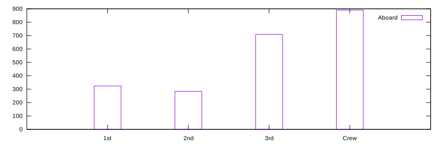
by_class_aboard.svg)Practice this topic in Challenge 3: Ask the first plot a different question.
For the native table example, change the remote formula's $2 to $3
and rename its Aboard heading to Survived before recomputing and plotting.
Restore both afterwards. In the next topic, a Babel block will link its
output figure automatically.
3 — One series, minimal code
New here: categorical positions and boxes, rather than the numeric x
coordinates and points in the introduction. using 3:xtic(1) takes
values from column 3 and category labels from column 1. This version shows
only survivors. notitle suppresses an unhelpful data-source legend.
The zero baseline is explicit; descriptive wording is the next refinement.
Category labels versus numerical coordinates. xtic(1) supplies labels,
not numerical x positions: the classes are spaced equally by row. For age
data, use the actual age as x, for example using 1:2 when column 1 holds
age and column 2 holds the measured value. Ages 1, 4 and 10 must have gaps
of 3 and 6 years; plotting against row number would make both gaps equal.
Run listing 20 with C-c C-c.
#+name: fig-2
#+begin_src gnuplot :var data=titanic_by_class :file orgmode/figures/by_class_survivors.svg :exports code
set boxwidth .5 relative
set yrange [0:*]
plot data using 3:xtic(1) with boxes notitle
#+end_src
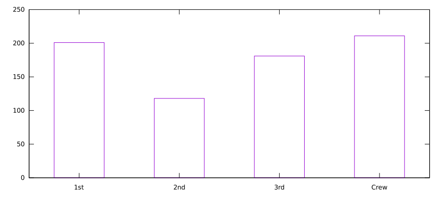
by_class_survivors.svg)Practice this topic in Challenge 4: Give bars an honest baseline.
4 — Two outcomes, readable labels
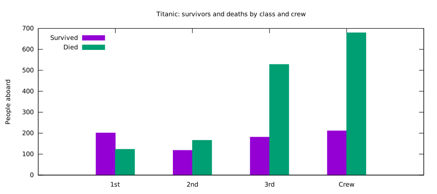
New here: histograms groups bars by category. Both outcomes share axes
and a legend. The comma and series title work just as they did for the
two synthetic series in the introduction. We repeat data for
clarity; later '' means reuse the preceding data source. Colours are
still gnuplot's defaults.
Run listing 21 with C-c C-c.
#+name: fig-3
#+begin_src gnuplot :var data=titanic_by_class :file orgmode/figures/by_class_outcomes.svg :exports code
set style data histograms
set style fill solid 1.0
set title "Titanic: survivors and deaths by class and crew"
set ylabel "People aboard"
set yrange [0:*]
set key top left
plot data using 3:xtic(1) title "Survived", \
     data using 4         title "Died"
#+end_src
by_class_outcomes.svg)Practice this topic in Challenge 5: Check two series against their total.
5 — Make the appearance deliberate
Every visual choice is explicit: left and bottom axes only (set border 3),
outward ticks, light horizontal guides and two colours chosen on purpose.
Use a strong colour for survivors and a quiet one for deaths. In a report,
the caption can carry the title rather than repeating it inside the figure.
Run listing 22 with C-c C-c.
#+name: fig-4
#+begin_src gnuplot :var data=titanic_by_class :file orgmode/figures/by_class_outcomes_styled.svg :exports code
reset
set encoding utf8
set border 3 lw 1.9
set tics out nomirror scale 0.9
set grid ytics lc rgb "#d5d8dc" lw .5
set key top left
set linetype 1 lc rgb "#14507d"
set linetype 2 lc rgb "#aab0b8"
set style fill solid 0.9 border -2
set style data histograms
set style histogram clustered gap 1
set boxwidth 0.9

set ylabel "People aboard"
set xlabel "Passenger class or crew"
set yrange [0:*]
plot data using 3:xtic(1) title "Survived", \
     data using 4         title "Died"
#+end_src
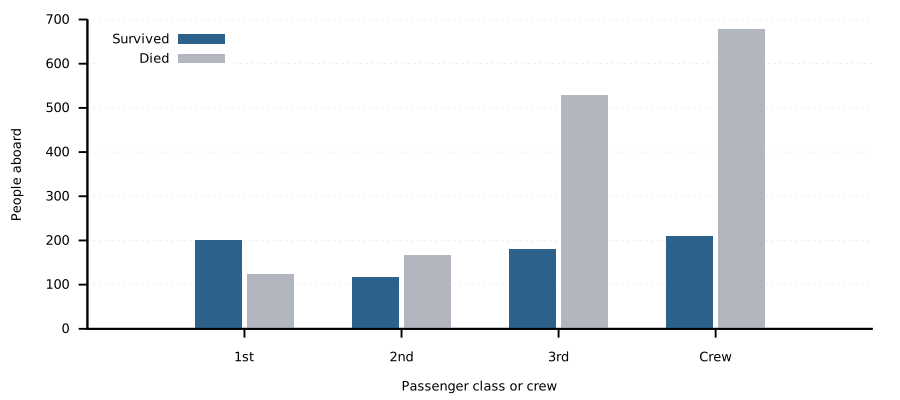
by_class_outcomes_styled.svg)Most of the setup describes a visual style, not this particular question. Repeating those settings in every plot invites inconsistent edits.
Practice this topic in Challenge 6: Make one visual change at a time.
Define the shared style
A shared style contains settings, not a plot command. It travels with
the project and can be inspected by another reader. A personal ~/.gnuplot
would apply invisibly on one machine without necessarily travelling with
the lesson.
Listing 23 is a named settings block with :eval never.
Later blocks use <<plot-style>>: Org replaces that Noweb reference with
the block's text before running gnuplot. :noweb no-export keeps the short
reference visible in the export.
#+name: plot-style
#+begin_src gnuplot :eval never :exports code :tangle orgmode/plots/plot-style.gp
# Shared report settings. Later styled examples explicitly include this block;
# the introduction and the simple pie do not depend on it.
reset
if (GPVAL_VERSION < 6.0) { exit error "Need gnuplot 6.0 or newer" }
set encoding utf8
set border 3 lw 1.9
set tics out nomirror scale 0.9
set grid ytics lc rgb "#d5d8dc" lw .5
set key top left
set linetype 1 lc rgb "#14507d"
set linetype 2 lc rgb "#aab0b8"
set style fill solid 0.9 border -2
set style data histograms
set style histogram clustered gap 1
set boxwidth 0.9
#+end_src
The settings can also be tangled with C-c C-v t into orgmode/plots/plot-style.gp.
That optional file can be loaded by another gnuplot script; normal Babel
execution expands the named block directly.
6 — Reuse the shared style
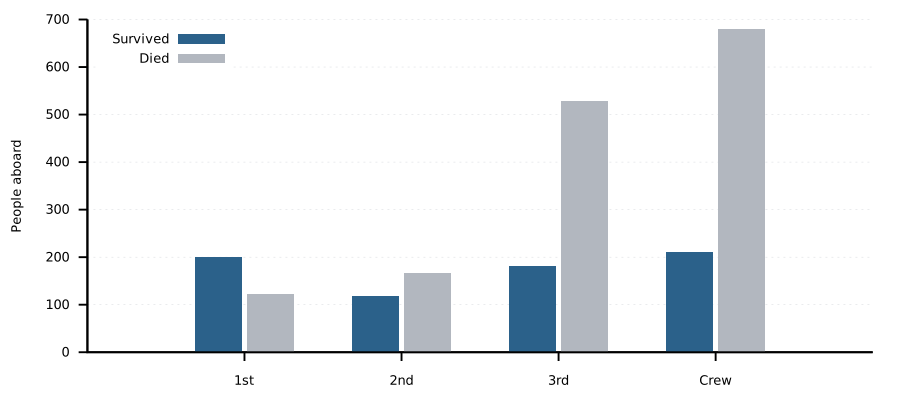
This recreates the deliberately styled grouped plot. Its appearance should match the previous figure apart from the x-axis label: the style has moved, not the question. Each plot now contains primarily what is specific to its data and comparison.
Run listing 24 with C-c C-c.
#+name: fig-5
#+begin_src gnuplot :var data=titanic_by_class :file orgmode/figures/by_class_outcomes_shared_style.svg :exports code
<<plot-style>>
set ylabel "People aboard"
set yrange [0:*]
plot data using 3:xtic(1) title "Survived", \
     ''   using 4         title "Died"
#+end_src
by_class_outcomes_shared_style.svg)Practice this topic in Challenge 7: Change a shared setting once.
7 — Stacked counts including crew
rowstacked puts survivors and deaths on top of each other. The total
height of each bar is the size of the group, so this chart answers both
“how large was the group?” and “how did its outcomes divide?”
Run listing 25 with C-c C-c.
#+name: fig-6a
#+begin_src gnuplot :var data=titanic_by_class :file orgmode/figures/by_class_outcomes_stacked.svg :exports code
<<plot-style>>
set style histogram rowstacked
set ylabel "People aboard"
set yrange [0:*]
plot data using 3:xtic(1) title "Survived", \
     ''   using 4         title "Died"
#+end_src
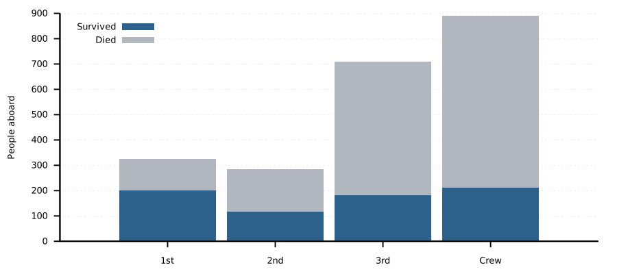
by_class_outcomes_stacked.svg)The bar totals are 324, 284 and 709 passengers, followed by 890 crew. Crew is the largest group, with 679 deaths; third class has 528 deaths. Both groups are larger than either first or second class.
Practice this topic in Challenge 8: Choose between stacked and grouped counts.
8 — One hundred percent stacks
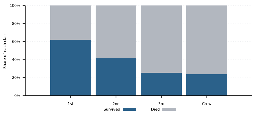
The same stacks are now scaled to 100 per cent. A computed column is an
expression in parentheses; $3 means “column 3 of this row”.
Survived divided by aboard, multiplied by 100, is the survival percentage.
The survivors' and deaths' percentages add to 100 within each group.
Keep the expression in parentheses: ($3/$2*100) is a calculation, whereas
an unparenthesised using entry is interpreted as a column specification.
Run listing 26 with C-c C-c.
#+name: fig-6b
#+begin_src gnuplot :var data=titanic_by_class :file orgmode/figures/by_class_outcome_percentages.svg :exports code
<<plot-style>>
set style histogram rowstacked
set ylabel "Share of each class"
set yrange [0:100]
set format y "%.0f%%"
set key below
plot data using ($3/$2*100):xtic(1) title "Survived", \
     ''   using ($4/$2*100)         title "Died"
#+end_src
by_class_outcome_percentages.svg)Practice this topic in Challenge 9: Distinguish a share from a count.
9 — Rates with exact labels
New here: one rate per group, followed by an optional text layer. The denominator is still the aboard count of that same class or Crew group, not the total of 2,207. First draw the bars without formatting strings.
First pass — only the rates
Use listing 27 after the input setup from the preceding
class-count example: data must refer to titanic_by_class. In Org, copy
that example's complete block (including :var data=titanic_by_class),
give it a new name and file path, and replace its body with this listing.
In a terminal script, retain the CSV separator, column-header, data,
terminal and output setup, but replace the plotting body. This is a
replacement body, not an independently runnable source block.
#+name: rates-first-pass
#+begin_src gnuplot :eval never
set ylabel "Survived (%)"
set yrange [0:100]
set boxwidth 0.6
plot data using 0:($3/$2*100):xtic(1) with boxes notitle
#+end_src
0 is the row index (0, 1, 2, 3), used for the bar positions. The
calculated y value is the same percentage introduced in the preceding
chapter. Check the first-class bar: 201/324*100 is about 62.0%.
Report extension — exact labels and shared appearance
The complete version below retains the report styling. Its only new plot
layer is with labels: x and y place the text, and sprintf supplies it.
The function survival_percent names the repeated calculation; it does
not create or regroup data. %.1f formats one decimal place, and %%
prints a literal percent sign. Compare bar heights before and after adding
the label layer: none should move. Challenge 10 practices the precision.
Run listing 28 with C-c C-c.
#+name: fig-6c
#+begin_src gnuplot :var data=titanic_by_class :file orgmode/figures/by_class_survival_rate.svg :exports code
  <<plot-style>>
survival_percent(survived, aboard) = 100.0 * survived / aboard
set ylabel "Survived"
set yrange [0:100]
set format y "%.0f%%"
set boxwidth 0.6
set offsets 0.5, 0.5, 0, 0

# Both layers use the same x position and the same survival percentage.
plot data using 0:(survival_percent($3,$2)):xtic(1) with boxes notitle, \
     data using 0:(survival_percent($3,$2)):(sprintf("%.1f%%", survival_percent($3,$2))) \
          with labels offset 0,0.5 notitle
#+end_src
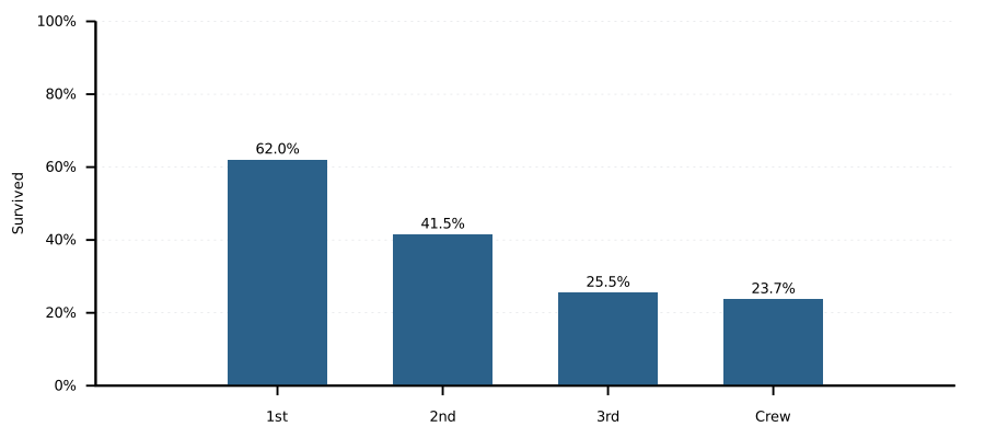
by_class_survival_rate.svg)The percentages are 62.0 for first class, 41.5 for second, 25.5 for third and 23.7 for Crew. Rates compare survival within groups; they do not show how many people were aboard.
| Class | Survived % |
|---|---|
| 1st | 62.0 |
| 2nd | 41.5 |
| 3rd | 25.5 |
| Crew | 23.7 |
Practice this topic in Challenge 10: Decide how much precision to show.
Org can also calculate those percentages in a table. The example below
uses the same remote rows; copy it into the buffer and run its formula with
C-c C-c. @@# selects the matching row, so both tables must keep the same
class order.
#+name: rates-table-example
#+begin_src org :eval never :exports code
#+name: rates
| Class | Survived % |
|-------+------------|
| 1st   |       62.0 |
| 2nd   |       41.5 |
| 3rd   |       25.5 |
| Crew  |       23.7 |
#+TBLFM: $2=(remote(titanic_by_class,@@#$3)/remote(titanic_by_class,@@#$2))*100;%.1f
#+end_src
10 — Class and sex
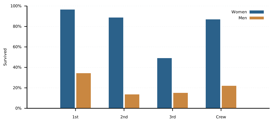
Compare women's and men's survival rates within each group. Women use columns 3/2; men use 6/5. Each denominator must be that group's own aboard count, not the total number of survivors or the total aboard.
The colours now encode sex rather than survival outcome. A linetype number only selects a style: change its colour and the legend together when the plot's question changes. These categories include children.
Run listing 30 with C-c C-c.
#+name: fig-6d
#+begin_src gnuplot :var sex=titanic_by_sex :file orgmode/figures/by_class_and_sex_survival_rates.svg :exports code
<<plot-style>>
set linetype 1 lc rgb "#14507d"   # women
set linetype 2 lc rgb "#c47a2c"   # men
set ylabel "Survived"
set yrange [0:100]
set format y "%.0f%%"
set key top right
plot sex using ($3/$2*100):xtic(1) title "Women", \
     sex using ($6/$5*100)         title "Men"
#+end_src
by_class_and_sex_survival_rates.svg)Practice this topic in Challenge 11: Compare within a group.
11 — A pie with circles
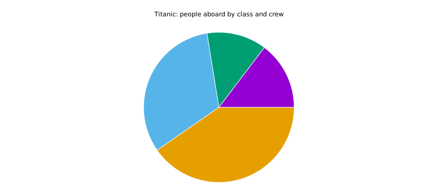
A pie shows one whole divided into parts. Here the whole is everyone aboard, including crew. Use it for one composition; bars are clearer for comparing survival rates between groups.
For a simple pie, with circles is sufficient in gnuplot 6: supply the
centre, radius, start angle and end angle for each slice, plus its colour.
The default set style circle wedge connects the arc to the centre.
No polar mode is needed. The donut chapter introduces with sectors for
actual ring segments; using gnuplot 6 does not mean replacing every older style.
New here: stats data using 2 nooutput reads the aboard column and stores
its sum as STATS_sum. Save that as total (2,207). The named function
angle_for_count converts a count into its share of 360 degrees.
For example, first class occupies 324/2207*360, about 52.85 degrees.
The running variable angle_end carries one slice's end to the next
slice's start. Start with slices only: labels are an extension in Challenge 12.
Run listing 31 with C-c C-c.
#+name: fig-7a
#+begin_src gnuplot :var data=titanic_by_class :file orgmode/figures/by_class_aboard_pie.svg :exports code
reset
# reset leaves Cartesian coordinates and unrestricted ranges for stats.
stats data using 2 nooutput
total = STATS_sum
angle_for_count(people) = people * 360.0 / total

set title "Titanic: people aboard by class and crew"
set angles degrees
unset border
unset tics
unset grid
unset key
set size ratio -1
set xrange [-1.05:1.05]
set yrange [-1.05:1.05]
set style fill solid 1.0 border lc rgb "white"
# circles: x : y : radius : start angle : end angle : color
angle_end = 0
plot data using (0):(0):(1):(angle_end): \
     (angle_end = angle_end + angle_for_count($2)):($0 + 1) \
     with circles linecolor variable notitle
#+end_src
by_class_aboard_pie.svg)
This example starts with reset, so stats runs before restrictive
ranges or polar mode are enabled. For a pasted fragment in an existing
session, run unset polar and set autoscale before stats.
Read the last line of the calculation from left to right: the fourth
circle column reads the old angle_end; the fifth adds this row's angular
width and returns the new end. This single update is necessary to join
successive slices. Before repeating the plot, reset angle_end to zero;
plain replot alone would reuse the accumulated value.
The sixth column selects a distinct default colour via linecolor variable.
($0 + 1) turns row indices 0–3 into colour indices 1–4.
The explicit ranges leave room around the unit circle, avoid the empty-y-range
warning and prevent clipping artefacts at the circle's boundary. The equal
axis scale (set size ratio -1) keeps the pie circular, not elliptical.
Optional report palette
The default colours distinguish the construction's four slices. To recover the muted report palette, insert listing 32 before the plot and rerun the complete example. This changes appearance, not shares. The label challenge uses this darker palette so white text remains readable.
#+name: pie-report-colours
#+begin_src gnuplot :eval never
set linetype 1 linecolor rgb "#14507d"
set linetype 2 linecolor rgb "#4f86b5"
set linetype 3 linecolor rgb "#6f9bc4"
set linetype 4 linecolor rgb "#476178"
#+end_src
Angles start at three o'clock and run anticlockwise in table order: first class, second class, third class, then Crew. This deliberately unlabelled plot is a construction step, not a finished communication graphic. Without the table order, a reader cannot identify the slices from colour alone.
Complete it in Challenge 12: Give the slices names and percentages.
12 — Heatmaps and age panels
Class and sex
Each cell is a rectangle coloured by its survival percentage. With only
eight cells a table would also work; the heatmap becomes more useful as
the grid grows. Here with boxxyerror draws the cells.
The five using values are x, y, horizontal half-width, vertical half-height
and colour value. using (0):0 places women at x=0 and each data row on its
own y coordinate. Pseudo-column 0 is the row index.
Run listing 33 with C-c C-c.
#+name: fig-7b
#+begin_src gnuplot :var sex=titanic_by_sex :file orgmode/figures/by_class_and_sex_survival_heatmap.svg :exports code
<<plot-style>>
unset grid; unset key
set xrange [-0.5:1.5]
set yrange [3.5:-0.5]
set xtics ("Women" 0, "Men" 1) scale 0
set ytics scale 0
set palette defined (0 "#ffffff", 100 "#4f86b5")
set cbrange [0:100]
set format cb "%.0f%%"
set cblabel "Survived"
set style fill solid 1.0 border lc rgb "white"

plot sex using (0):0:(0.5):(0.5):($3/$2*100):ytic(1) with boxxyerror lc palette, \
     ''  using (1):0:(0.5):(0.5):($6/$5*100)         with boxxyerror lc palette, \
     ''  using (0):0:(sprintf("%.0f%%", $3/$2*100))  with labels, \
     ''  using (1):0:(sprintf("%.0f%%", $6/$5*100))  with labels
#+end_src
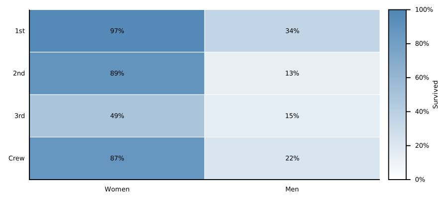
by_class_and_sex_survival_heatmap.svg)Reversing the y range puts first class at the top. The palette represents 0–100%; its darkest colour remains light enough for the dark labels.
Practice this topic in Challenge 13: Read the same rates in two encodings.
Age and class — the large heatmap
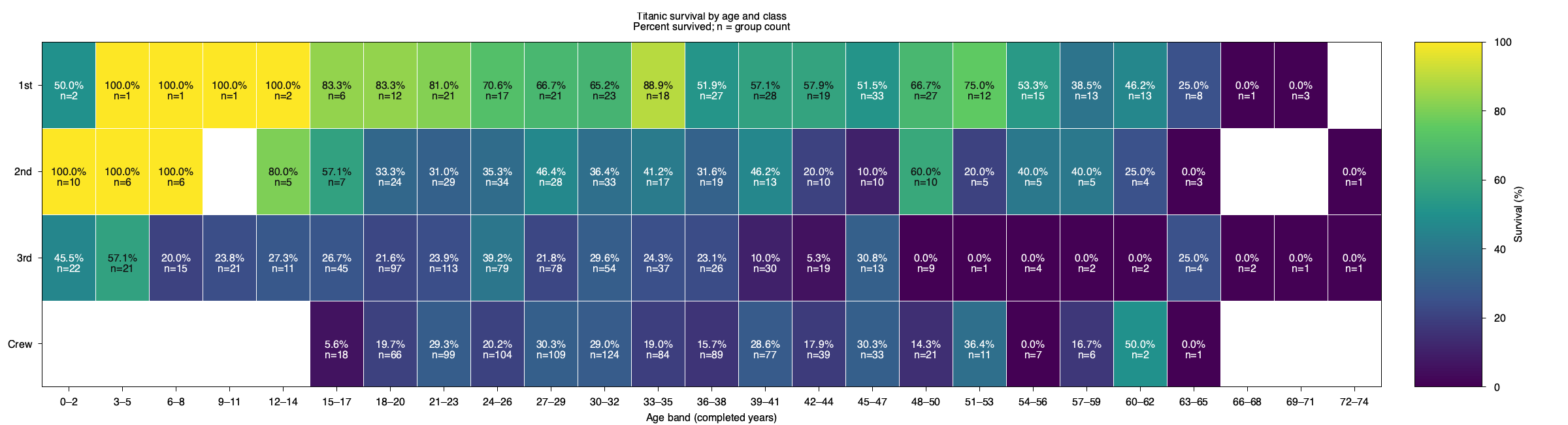
Now show 25 three-year age bands across all four groups, including Crew.
Use titanic_by_age_and_class.csv, whose columns are age_midpoint,
class_code, survival_pct, n and survivors. These 100 cells describe
2,205 people with known age; the two unknown ages are excluded.
Percentages and group counts are already calculated.
Listing 17 stores the complete summary as an Org
table. The plot's :var data=titanic_by_age_and_class supplies it through
Babel's temporary plot input. :colnames yes handles the table header;
do not additionally skip a row. In this execution, from_org is true.
When running the tangled script outside Babel, its input is
orgmode/data/titanic_by_age_and_class.csv. The author build (make evaluate)
creates this copy from the same download; alternatively, save the published
CSV there yourself. Run the script from the project root, as with all tangled
Org-mode scripts. No dataset-document build is needed.
Run listing 34 with C-c C-c.
#+name: titanic-survival-heatmap
#+begin_src gnuplot :var data=titanic_by_age_and_class :session none :file orgmode/figures/by_age_and_class_survival_heatmap.png :dir . :results file graphics :exports both :tangle orgmode/plots/by_age_and_class_heatmap.gp
reset
from_org = exists("data")
if (!from_org) data = "orgmode/data/titanic_by_age_and_class.csv" # run from project root
set terminal pngcairo size 2400,650 enhanced font "Sans,12"
set output "orgmode/figures/by_age_and_class_survival_heatmap.png"
if (from_org) { set datafile separator whitespace } else { set datafile separator "," }
set datafile missing "NA"
set title "Titanic survival by age and class\nPercent survived; n = group count"
set xlabel "Age band (completed years)"
set xrange [-0.5:74.5]
set yrange [4.5:0.5]
set xtics ("0–2" 1, "3–5" 4, "6–8" 7, "9–11" 10, "12–14" 13, "15–17" 16, "18–20" 19, "21–23" 22, "24–26" 25, "27–29" 28, "30–32" 31, "33–35" 34, "36–38" 37, "39–41" 40, "42–44" 43, "45–47" 46, "48–50" 49, "51–53" 52, "54–56" 55, "57–59" 58, "60–62" 61, "63–65" 64, "66–68" 67, "69–71" 70, "72–74" 73)
set ytics ("1st" 1, "2nd" 2, "3rd" 3, "Crew" 4)
set tics out nomirror
set key off
set palette defined (0 "#440154", 25 "#3b528b", 50 "#21918c", 75 "#5ec962", 100 "#fde725")
set cbrange [0:100]
set cblabel "Survival (%)"
set style fill solid 1.0 border lc rgb "white"

# Cells are centred on integer age labels; their width represents three years.
plot data using 1:2:($1-1.5):($1+1.5):($2-0.5):($2+0.5):3 \
        with boxxyerror linecolor palette, \
     data using 1:2:(sprintf("%.1f%%\nn=%d", $3, $4)):($3 >= 55 ? 0x111111 : 0xffffff) \
        with labels textcolor rgb variable font "Sans,12"
unset output
#+end_src
by_age_and_class_survival_heatmap.png)
This form of boxxyerror uses seven values: x/y centre, left/right bounds,
lower/upper bounds and colour value. Each cell spans three years and one
class category.
The second layer adds the percentage and group count, switching text colour
for contrast. NA leaves the 12 empty groups blank, unlike an observed 0%.
Small n matters: 100% with n=1 means one survivor out of one person.
Open the PNG at full size to inspect all 25 columns.
Practice this topic in Challenge 14: Show when a percentage has little support.
Age trends in four panels
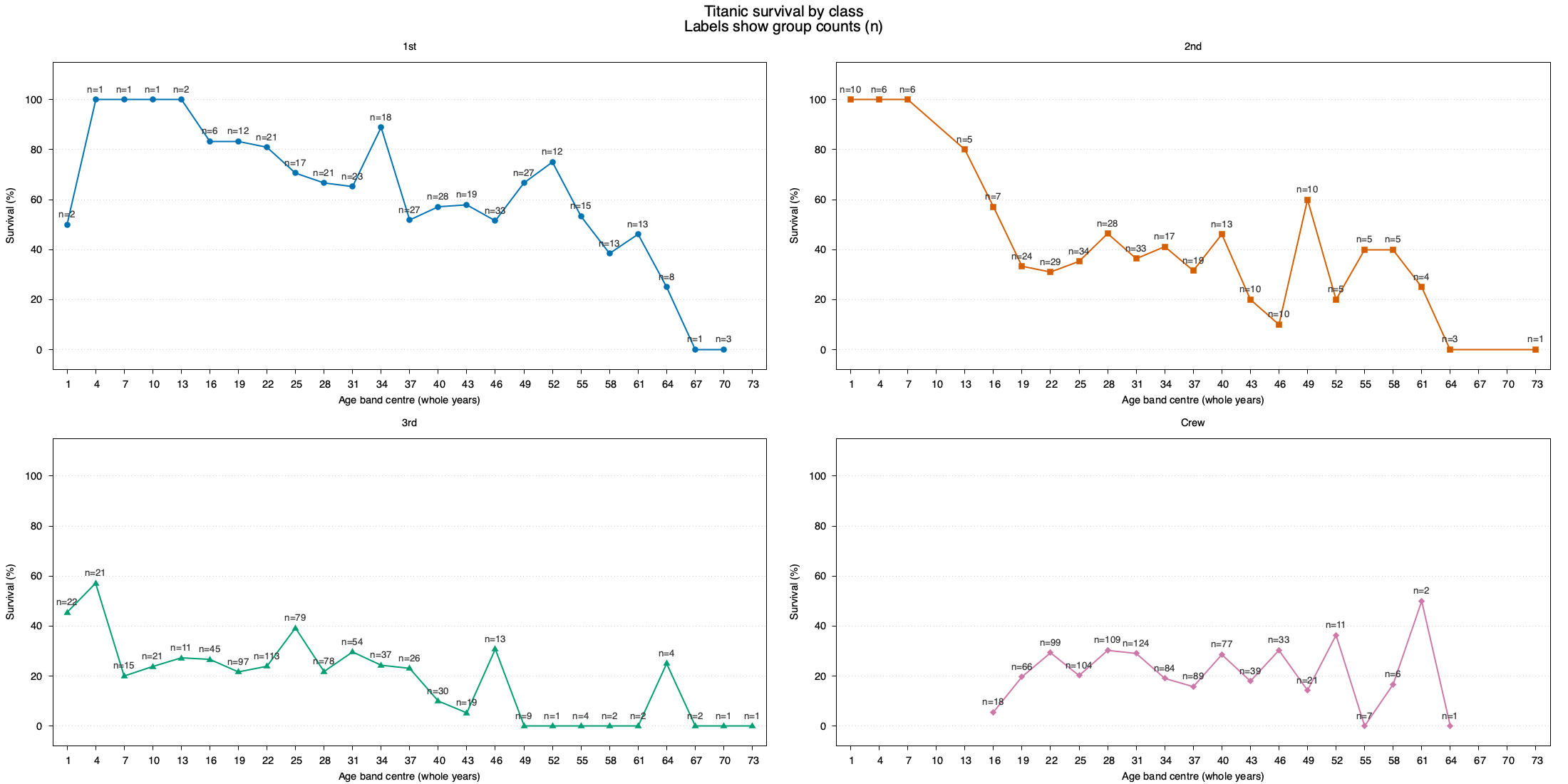
Use the same age/class summary for a four-panel plot, including Crew. Identical axes make the age patterns easier to compare. Points represent three-year groups, not individual ages, and the labels report group counts.
Run listing 35 with C-c C-c.
#+name: titanic-survival-panels
#+begin_src gnuplot :var data=titanic_by_age_and_class :session none :file orgmode/figures/by_age_and_class_survival_panels.png :dir . :results file graphics :exports both :tangle orgmode/plots/by_age_and_class_panels.gp
reset
header_rows = exists("data") ? 0 : 1 # Babel removes the table header
from_org = exists("data")
if (!from_org) data = "orgmode/data/titanic_by_age_and_class.csv" # run from project root
set terminal pngcairo size 2200,1100 enhanced font "Sans,11"
set output "orgmode/figures/by_age_and_class_survival_panels.png"
if (from_org) { set datafile separator whitespace } else { set datafile separator "," }
set datafile missing "NA"
set xrange [-0.5:74.5]
set yrange [-8:115]
set xtics 1,3,73
set ytics 0,20,100
set xlabel "Age band centre (whole years)"
set ylabel "Survival (%)"
set grid ytics
set tics out nomirror
set key off
set style line 1 lc rgb "#0072B2" lw 2 pt 7
set style line 2 lc rgb "#D55E00" lw 2 pt 5
set style line 3 lc rgb "#009E73" lw 2 pt 9
set style line 4 lc rgb "#CC79A7" lw 2 pt 13
classes = "1st 2nd 3rd Crew"

set multiplot layout 2,2 rowsfirst title "Titanic survival by class\nLabels show group counts (n)" font "Sans,16"
do for [c=1:4] {
    set title word(classes,c)
    plot data every 4::(header_rows+c-1) using 1:3 with linespoints linestyle c pointsize 1.1, \
         data every 4::(header_rows+c-1) using 1:3:(sprintf("n=%d", $4)) \
             with labels offset char 0,1 textcolor rgb "#333333" font "Sans,10"
}
unset multiplot
unset output
#+end_src
by_age_and_class_survival_panels.png)
set multiplot layout 2,2 arranges four panels. The loop selects class
codes 1–4, and every 4::(header_rows+c-1) takes every fourth record for
class c. Keep the published ordering: each age band contains all four
class codes, even where a group is empty.
word(classes,c) chooses the title and linestyle c its colour and marker.
unset multiplot finishes the layout. The lines guide the eye; they are
not a fitted model. Missing groups are not zero-percent survival, and
extreme percentages from small groups deserve caution.
Babel removes the table header, so header_rows is 0. The optional
standalone fallback in this block uses 1 for a plain CSV header without
set datafile columnheaders; it is not used when Babel supplies data.
Practice this topic in Challenge 15: Do lines imply more than the data show?.
13 — A dumbbell chart
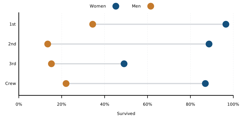
A dumbbell connects the men's survival rate to the women's rate for each class or crew group. The line's length is their gap.
New here: horizontal displacement between two already familiar rates.
As in the rate example, survival_percent names the repeated arithmetic.
Column 3 divided by 2 is the women's rate; column 6 divided by 5 is the
men's rate. Subtracting them gives percentage points, not percent change.
The colours and larger points below are the report layer, not new data.
with vectors takes x:y:dx:dy: a starting point and a displacement.
Start at the men's rate, use the difference between the rates as dx, and
keep dy at zero. nohead removes the arrowhead to leave a connecting line.
Run listing 36 with C-c C-c.
#+name: fig-7c
#+begin_src gnuplot :var sex=titanic_by_sex :file orgmode/figures/by_class_and_sex_survival_gap.svg :exports code :term "svg size 820,400 font 'sans,14'"
<<plot-style>>
survival_percent(survived, aboard) = 100.0 * survived / aboard
unset grid
set grid xtics lc rgb "#d5d8dc" lw 0.8
set xrange [0:100]
set yrange [3.6:-0.6]
set format x "%.0f%%"
set xlabel "Survived"
set ytics scale 0
set key above
set linetype 1 lc rgb "#14507d"   # women
set linetype 2 lc rgb "#c47a2c"   # men

plot sex using (survival_percent($6,$5)):0:(survival_percent($3,$2) - survival_percent($6,$5)):(0):ytic(1) \
         with vectors nohead lw 4 lc rgb "#d5d8dc" notitle, \
     ''  using (survival_percent($3,$2)):0 with points pt 7 ps 2 lc 1 title "Women", \
     ''  using (survival_percent($6,$5)):0 with points pt 7 ps 2 lc 2 title "Men"
#+end_src
by_class_and_sex_survival_gap.svg)Practice this topic in Challenge 16: Add an honest name for the gap.
14 — Five measures on a spider plot
A spider or radar plot shows several measures of one thing at once: one axis per measure, one polygon per row. Each class or crew group is a polygon across five percentages derived from the class-and-sex counts. This course uses gnuplot 6.0 or newer, including for spider plots.
Each plot clause adds an axis. All axes run from 0 to 100, and
set paxis ... label supplies each spoke label and its rotation.
Run listing 37 with C-c C-c.
#+name: fig-7d
#+begin_src gnuplot :var sex=titanic_by_sex :file orgmode/figures/by_class_profile_spider.svg :exports code :term "svg size 820,640 font 'sans,14'"
  <<plot-style>>

  set title "Titanic survival by class and sex" offset 0,1 font ",18"
  unset border; unset tics; unset grid
  set spiderplot

  # One axis per plot clause below: five measures, all in per cent
  set for [p=1:5] paxis p range [0:100]
  set paxis 1 tics 0,25,100 format "%.0f%%"
  set for [p=2:5] paxis p tics format ""

  # Spoke labels, each at right angles to its spoke. Spoke p points at
  # 90 - (p-1)*72 degrees; the label is turned 90 degrees less than that,
  # and turned over by 180 where it would otherwise stand upside down.
  set paxis 1 label "All survived"   rotate by   0
  set paxis 2 label "Women survived" rotate by -72
  set paxis 3 label "Men survived"   rotate by  36
  set paxis 4 label "Women aboard"   rotate by -36
  set paxis 5 label "Men aboard"     rotate by  72

  set grid spiderplot lc rgb "#d0d0d0" dt 2 lw 1
  set style spiderplot fs transparent solid 0.18 border lw 2
  set key outside right center

  # One polygon per row of the table: three passenger classes and crew
  set linetype 1 lc rgb "#14507d" lw 3
  set linetype 2 lc rgb "#c47a2c" lw 3
  set linetype 3 lc rgb "#3f8f5a" lw 3
  set linetype 4 lc rgb "#8064a2" lw 3

  # Columns: 2 women aboard, 3 women survived, 5 men aboard, 6 men survived
  # key(1) names each polygon after column 1 (1st, 2nd, 3rd, Crew)
  plot \
       sex using (($3+$6)/($2+$5)*100):key(1) with spiderplot notitle, \
       sex using ($3/$2*100)                  with spiderplot notitle, \
       sex using ($6/$5*100)                  with spiderplot notitle, \
       sex using ($2/($2+$5)*100)             with spiderplot notitle, \
       sex using ($5/($2+$5)*100)             with spiderplot notitle
#+end_src
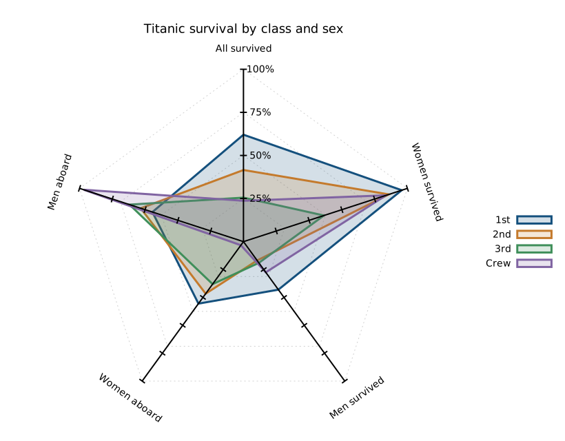
by_class_profile_spider.svg)The last two axes are group composition—the shares of women and men aboard—not survival rates. They sum to 100 and therefore mirror each other. Crew is overwhelmingly male and has the lowest overall survival rate, 23.7%. This describes the group; it does not establish why people survived.
Practice this topic in Challenge 17: Test whether polygon shape is evidence.
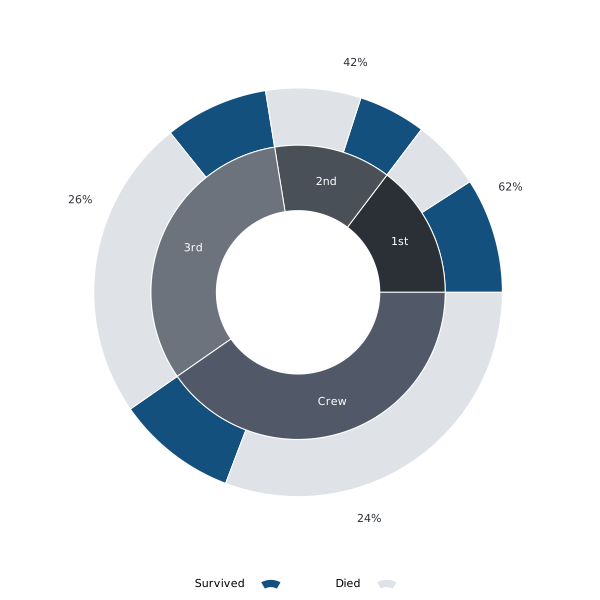
15 — Class size and fate in a donut
The inner ring divides everyone aboard into three passenger classes and crew. The outer ring splits each group into survivors and deaths. It combines the two messages of the stacked counts: group size and outcome.
This is an optional report example, not the next minimal plotting command. New here are ring boundaries and layered angular intervals; the calculations still use the same counts and whole as the pie. Read the inner-ring pass first, then the two outcome passes, and only then the label passes. The stacked chart remains a simpler way to communicate the same quantities.
Draw real ring segments with with sectors: class segments run from
hole_radius to split_radius; outcome segments run from split_radius
to outer_radius. The centre stays empty without a white covering disc.
Each pass resets pos so both rings share the same group boundaries.
Here the sectors columns are start angle:inner radius:angular width:radial width,
optionally followed by a colour. Where circles takes start and end
angles, sectors takes a start angle and angular width. In polar mode, labels take
angle:radius:text directly. See the gnuplot 6 manual, Sectors.
Run listing 38 with C-c C-c.
#+name: fig-7e
#+begin_src gnuplot :var data=titanic_by_class :file orgmode/figures/by_class_and_outcome_donut.svg :exports code :noweb yes :term "svg size 600,600 font 'sans,11'"
<<plot-style>>
unset polar
set autoscale
stats data using 2 nooutput
total = STATS_sum
set angles degrees
ang(n) = n * 360.0 / total

set polar
set theta right ccw
unset raxis
unset border; unset tics; unset grid
set key below horizontal center
set size ratio -1
set xrange [-1.35:1.35]
set yrange [-1.35:1.35]
set rrange [0:1.35]
set style fill solid 1.0 border lc rgb "white"
set linetype 3 lc rgb "#2b3036"
set linetype 4 lc rgb "#4a5058"
set linetype 5 lc rgb "#6c737c"
set linetype 6 lc rgb "#515969"

hole_radius = 0.40
split_radius = 0.72
outer_radius = 1.0
label_radius = (hole_radius + split_radius)/2
rate_radius = 1.16

# sectors: start angle : inner radius : angular width : radial width
# Each outcome pass advances pos by the WHOLE group, not just that outcome.
plot pos = 0, \
     data using (pos):(split_radius): \
          (span = ang($3), pos = pos + ang($2), span): \
          (outer_radius - split_radius) \
          with sectors lc rgb "#14507d" title "Survived", \
     pos = 0, \
     data using (pos + ang($3)):(split_radius): \
          (span = ang($4), pos = pos + ang($2), span): \
          (outer_radius - split_radius) \
          with sectors lc rgb "#dfe3e8" title "Died", \
     pos = 0, \
     data using (pos):(hole_radius): \
          (span = ang($2), pos = pos + span, span): \
          (split_radius - hole_radius):($0 + 3) \
          with sectors lc variable notitle, \
     pos = 0, \
     data using (mid = pos + ang($2)/2, pos = pos + ang($2), mid): \
                (label_radius):(strcol(1)) \
          with labels tc rgb "white" center notitle, \
     pos = 0, \
     data using (mid = pos + ang($2)/2, pos = pos + ang($2), mid): \
                (rate_radius):(sprintf("%.0f%%", 100.0 * $3 / $2)) \
          with labels tc rgb "#2b3036" center notitle
#+end_src
by_class_and_outcome_donut.svg)
The first pass draws survivors in blue; the second starts after those
survivors and fills the remaining group angle in light grey. Both passes
advance pos by the whole group's angle, but return only the outcome's
angular width. These widths use counts divided by the total aboard, so
survivors and deaths together align with the corresponding inner segment.
set polar lets the labels use angle:radius:text directly.
The plot uses square output dimensions rather than the wide default. Class names sit inside the inner ring and survival rates outside. Crew is the largest inner wedge, 40.3%, with a mostly grey outer rim. First class is 14.7% of those aboard and has a mostly blue rim.
Change hole_radius to adjust the hole. Keep
0 < hole_radius < split_radius < outer_radius=; the radial widths are
differences between these boundaries, not absolute outer radii.
label_radius keeps class names halfway across the inner ring.
Practice this topic in Challenge 18: Separate decoration from information.
16 — Tiny age-count bars
A sparkline is a chart about the size of a word: no axes, labels or legend, just the data's shape inside a sentence. It answers “what does the trend look like?” without interrupting the reading.
Use titanic_by_age.csv with its 25 three-year groups from 0–2 to 72–74.
Both sexes, all classes and crew are included; two unknown ages are excluded.
These bars show how many people were in each age group, not how many survived.
Run listing 39 with C-c C-c.
#+name: spark-count
#+begin_src gnuplot :var data=titanic_by_age :file orgmode/figures/by_age_people_sparkline.svg :exports code :term "svg size 120,24"
<<plot-style>>
unset border; unset tics; unset key; unset grid
set margins 0, 0, 0, 0
set yrange [0:*]
set offsets 0.5, 0.5, 0, 0
set boxwidth 0.7
set style fill solid 1.0 noborder
plot data using 0:2 with boxes lc 1
#+end_src

by_age_people_sparkline.svg)
The SVG is only 120 by 24 pixels. Removing axes, tics, legend and grid,
and setting all margins to zero, leaves room for the data.
set offsets preserves a little horizontal space so the end bars are not
cut off. Pseudo-column 0 places the rows at positions 0, 1, 2, … because
the age labels in the first column are text.
Practice this topic in Challenge 19: Make a tiny chart understandable.
17 — An inline survival trend
The same age groups now show the survival percentage as a line—not the
number of survivors. Keep set yrange [0:100] so the vertical scale remains
comparable between survival sparklines. Without it, small differences could
be stretched to the full height.
Run listing 40 with C-c C-c.
#+name: spark-rate
#+begin_src gnuplot :var data=titanic_by_age :file orgmode/figures/by_age_survival_sparkline.svg :term "svg size 120,24" :exports code
<<plot-style>>
unset border; unset tics; unset key; unset grid
set margins 0, 0, 0, 0
set yrange [0:100]
set offsets 0.3, 0.3, 0, 0
plot data using 0:3 with lines lw 1.5 lc 1
#+end_src

by_age_survival_sparkline.svg)
Inside a sentence, the spark macro sets the image to line height:
HTML uses an <img> element and PDF uses \includesvg.
An ordinary file link instead produces a larger figure.
Most people were young adults ; survival varies
non-monotonically with age .
The highest published rate is 67.9% for ages 3–5, compared with 61.8% for ages 0–2. The three oldest groups have no recorded survivors, but their counts are small. The trend is not monotonic.
Practice this topic in Challenge 20: See what an automatic scale hides.
18 — Run the complete set again
After working through every plot, rerun the complete sequence. Check that all eighteen figures are present, including the large age/class heatmap and four-panel age comparison. Revisit the data description and the interpretation whenever changing the dataset version.
A reproducible rerun should not depend on invisible settings from an earlier interactive session. Keep the published inputs, explicit plotting commands and shared style together.
Use C-c C-v b to run the executable Babel blocks. The shared style and
literal org examples are marked :eval never; the plotting blocks expand
the style through Noweb.
For the native table example, copy its contents into the buffer, recompute
its formula and run M-x org-plot/gnuplot. The author command make evaluate
also handles that example automatically, refreshes the five downloads,
runs all plots and updates the exported figure assets.
To rebuild the training HTML and PDF, use make orgmode. make -B forces
extraction, evaluation and all exports. Copy lasting edits in generated
Org files back into plots-with-roots.dtx before extracting again.
Practice this topic in Challenge 21: Prove that an edit reaches the output.
19 — What the figures say
Of the 2,207 people in the published class table, 711 survived—about one in three. Passenger survival rates were 62.0% in first class, 41.5% in second and 25.5% in third; Crew's rate was 23.7%.
Crew also has the largest death count, 679, followed by third class with 528. Together these groups account for most deaths. Compare the stacked counts with the rate bars: a large number of deaths and a low survival rate are related but different descriptions.
Within every class and crew group, women survived at a higher rate than men. Among passengers, women's rates were approximately 97%, 89% and 49% in first, second and third class. Men's rates were approximately 34%, 13% and 15%. Among crew, 20 of 23 women survived (87%), compared with 191 of 867 men (22%). Read the small female crew count alongside its rate.
The age heatmap, four panels and sparkline show age patterns at different levels of detail. Only the two unknown ages are excluded from age-based plots; the class and sex plots include all records. Empty groups are not zero survival.
These numbers describe who survived, not why. The selected columns do not record deck location, access to lifeboats, evacuation timing or individual decisions. Do not infer causal effects of age, class or sex from these plots. Consult the dataset provenance before treating the supplied records as a definitive historical reconstruction.
The reported values belong to the pinned release. A new dataset version requires reviewing this interpretation as well as rerunning the code.
Practice this topic in Challenge 22: Write a claim the figure supports.
20 — Troubleshooting
Work through the same questions when a plot surprises you: is the input available, is it read correctly, are the selected columns appropriate, and have you rerun and reopened the right output?
| Symptom | Check |
|---|---|
command not found |
Install the required program or correct PATH, then restart the shell or Emacs. |
| Only one series appears | Check the comma separating plot elements and the selected columns. |
| Unexpected percentage | Check the numerator and that group's own denominator. |
| Missing first observation | Do not skip a row twice after handling the header. |
| Missing output figure | Check the output path and directory, and that the plot ran successfully. |
| Old figure remains visible | Rerun the code, then refresh the image display or browser. |
| Unexpected colours or axes | Start from reset and the explicit shared settings; check plot-specific overrides. |
| Spider syntax fails | Check that gnuplot is version 6.0 or newer. |
| An empty heatmap cell | Inspect n and NA before interpreting it as zero survival. |
Check that the five download blocks have stored results and that each
:var points to the intended named table. Use C-u C-c C-c if a cached
download needs refreshing. The Babel header, not a CSV import setting,
controls how the table is supplied to gnuplot.
For a literal org example, copy its contents out of the source block
before using native table commands. :eval never is intentional.
For export problems, use the Make targets so the shared listing style and
SVG-to-PDF conversion are loaded.
Practice this topic in Challenge 23: Catch a plausible but wrong plot.
Further reading
- Philipp K. Janert, Gnuplot in Action, Second Edition (Manning, 2016). Optional book on plotting and understanding data.
- Org Babel gnuplot tutorial. Worked examples of plotting functions and named tables in Org; some setup and output advice is historical.
- Plotting tables with org-plot. Examples and options for
#+PLOT:directives above Org tables.