Run the scripts, then reload this page. Figures use the downloaded Zenodo CSV datasets.
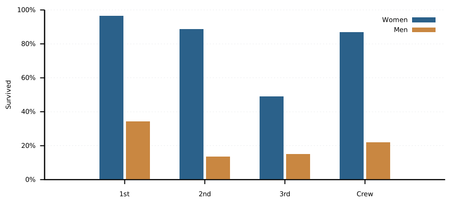
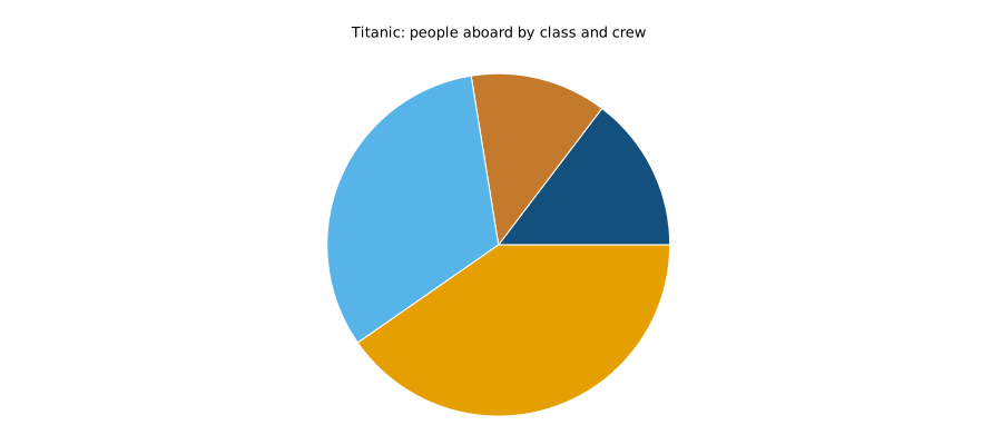
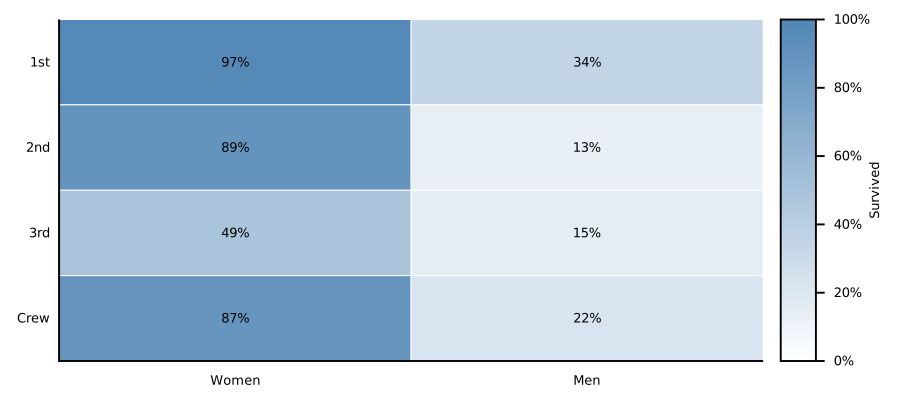
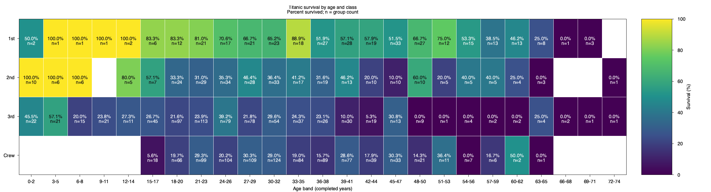
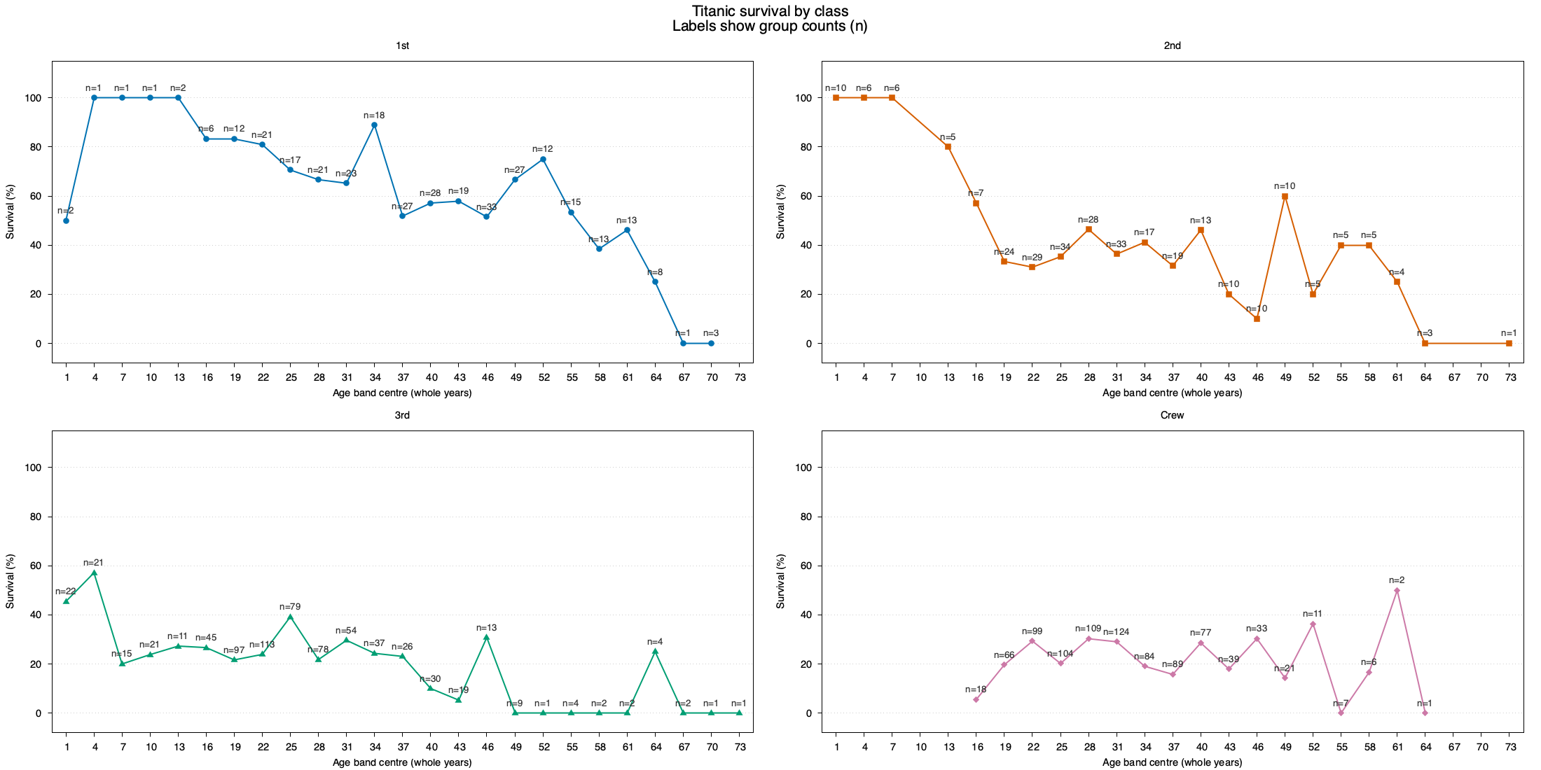
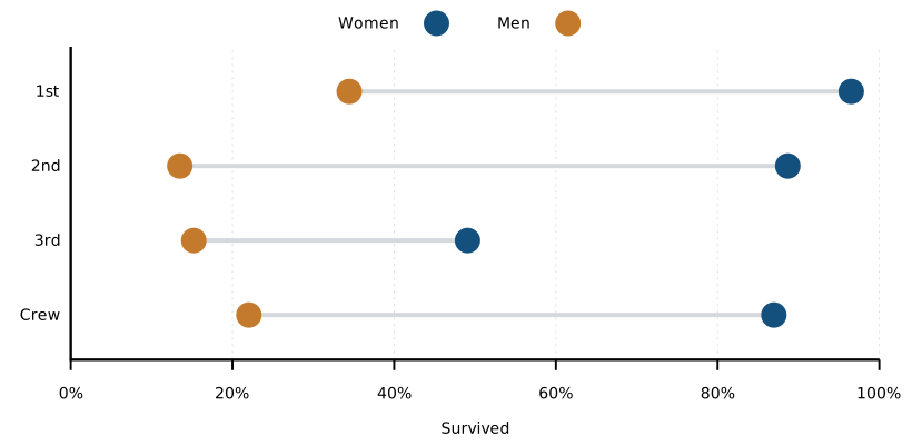
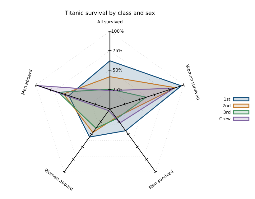
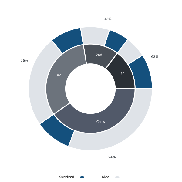
2 — A first plot3 — One series, minimal code4 — Two outcomes, readable labels5 — Make the appearance deliberate6 — Reuse the shared style7 — Stacked counts including crew8 — One hundred percent stacks9 — Rates with exact labels10 — Class and sex11 — A pie with circles12 — A heatmap12 — Age and class heatmap — by_age_and_class_survival_heatmap.png12 — Four age/class panels — by_age_and_class_survival_panels.png13 — A dumbbell chart14 — Five measures on a spider plot15 — Class size and fate in a donut16 — Tiny age-count bars17 — An inline survival trend