Plots with ROOTs
Data visualization with gnuplot.
A figure outlives the afternoon it was made in
Someone will correct a number, reuse the chart, or ask how it was made. Usually not you, and rarely soon.
Four questions for any technology
Can we inspect a failure and recover from it?
Can someone else understand and reuse it?
Can someone maintain and adapt it?
What experience supports the choice?
Asked here of one technology: gnuplot.
gnuplot in one sentence
A plain-text script turns a plain-text table into a figure.
<<plot-style>>
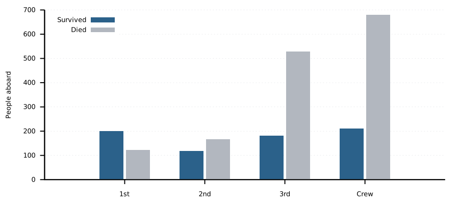
set ylabel "People"
set yrange [0:*]
plot data using 3:xtic(1) \
       title "Survived", \
     ''   using 4 \
       title "Died"
RRobust: text in, text out, nothing hidden
gnuplot gives you
- Every setting is a written command, not a state in a window
- The same script and data give the same figure
- Errors name the line and the problem
- It runs without a display: batch jobs, servers, CI
Caveat
- Startup files and leftover sessions can change a figure unseen
- Error messages are precise, but terse
OOpen: anyone can read it, run it, get it
gnuplot gives you
- Scripts and data are plain text: diff, review, version them
- Free to use, copy and distribute, since 1986
- Open outputs: SVG, PDF, PNG
- Linux, macOS, Windows and more
Caveat
- Its own licence: changes are shared as patches to the released version
- Fonts named in a script must exist where it runs
OOngoing: maintained, and still moving
gnuplot gives you
- Version 6.0 in December 2023; patch releases about twice a year
- Backwards compatibility is a stated priority
- New styles keep arriving: spider plots in 5.4, sectors for pies in 6.0
- In every package manager; Org ships the Babel backend
Caveat
- Compatibility is promised for gnuplot 5 code; check older scripts
- The newest styles need a recent version
TTime-tested: longevity as evidence, not proof
gnuplot gives you
- Four decades of use in papers, theses and manuals
- A large manual, FAQ, demo gallery and books
- Syntax learned once stays valid
- Problems people had before you, already answered
Caveat
- Age is evidence, not proof: terminals vary by build
- Its idioms predate today's plotting conventions
Where gnuplot is the wrong tool
- Terse syntax. Powerful once learned; a real learning curve before that.
- Statistics. Fitting, yes. Models, tests and resampling belong in R or Python.
- Exploration. Clicking through a dataset is faster in a notebook or a GUI.
- Grammar of graphics. ggplot2 or Vega-Lite state data-to-picture mappings more directly.
Choose it for what it is: a precise, scriptable, durable renderer.
In Org, the technology stays in view
Every step is plain text you can open and read.
One table, many questions
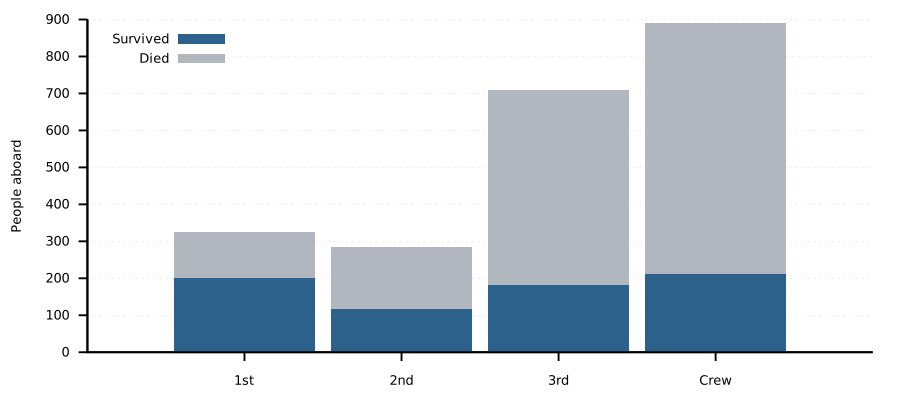
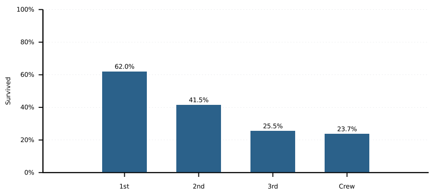
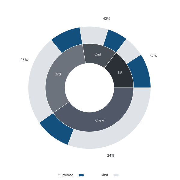
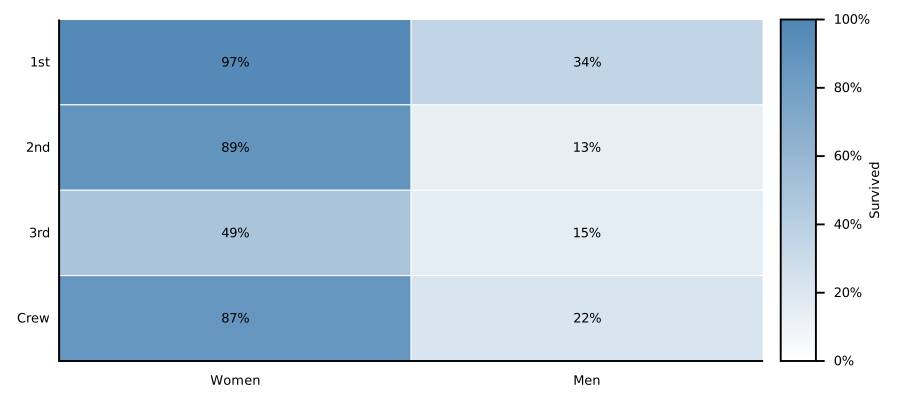
Ask the table a different question
live
plot data using 3:xtic(1)
plot data using ($3/$2*100):xtic(1)
One line changes. The data do not. The conclusion does.
Then: the axis label, the caption, and the sentence underneath.
Why gnuplot is a ROOT technology
Plain-text scripts, explicit settings, errors that name the line
Free to use, plain-text input, open output formats
Maintained, version 6 in 2023, compatibility a stated priority
In use since 1986, documented, widely answered
Notebook, slides and two references: all Org, all in one folder.